Reliable Tech
Proven experience, deep expertise, and seamless scalability to support clients’ business growth.
 Brand Identity Guidelines
Downloads
Brand Identity Guidelines
Downloads
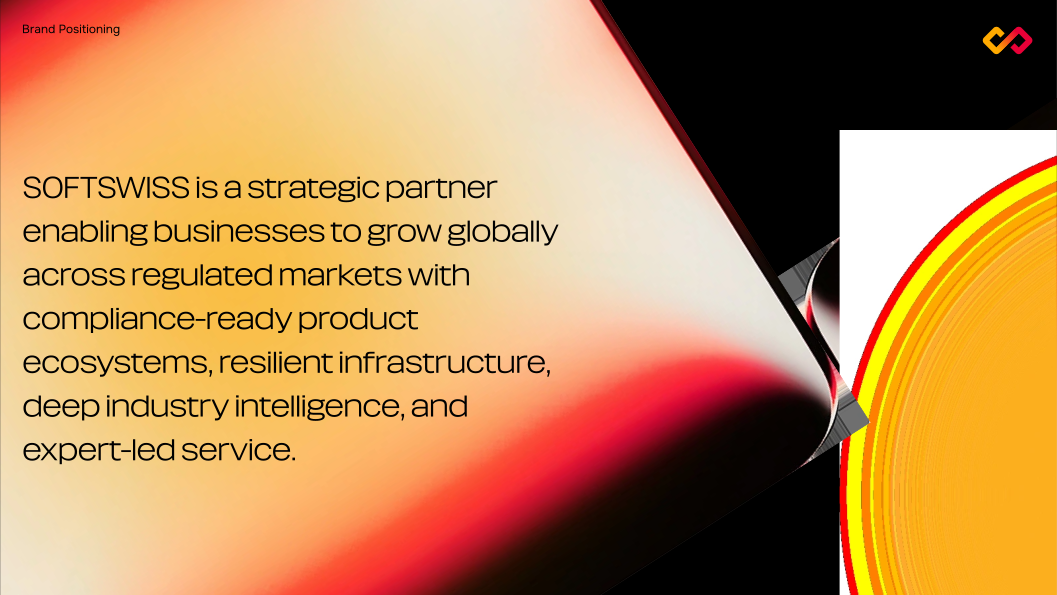
SOFTSWISS is a strategic partner enabling businesses to grow globally across regulated markets with compliance-ready product ecosystems, resilient infrastructure, deep industry intelligence, and expert-led service.
To be the world's leading trusted strategic technology partner for sustainable growth in regulated iGaming, combining compliance, reliability, market expertise, security, and an integrated ecosystem of technology products.
Sustainable growth, the ability to enter and expand across regulated markets — enabled by reliable, high-performance technology, a comprehensive and modular product ecosystem, deep regulatory expertise, and a trusted partnership committed to long-term business success.
Proven experience, deep expertise, and seamless scalability to support clients’ business growth.
Driven by a passion for our clients' success, we forge strong partnerships and deliver innovative solutions.
We deliver high-end services and support to meet your unique needs.
We uphold compliance, ensure security and act with integrity.
Every visual touchpoint should reinforce a consistent perception of SOFTSWISS as a Strategic Partner for Growth, reflecting who we are, what we stand for.
Our visuals should bring SOFTSWISS expertise, capabilities, and strengths to life, building trust and reinforcing our positioning while consistently reflecting our Brand Pillars.
Our visual identity should reflect the same qualities as our Tone of Voice: clarity, expertise, confidence, and controlled warmth. It should communicate business value through a professional yet approachable visual language.
Credibility is our emotional driver. Every visual touchpoint should inspire trust through clarity, consistency, and confidence, balancing technological sophistication with a human touch
Clear, expert, confident, and enabling — never arrogant. We speak with business value, and communicate with controlled warmth.
The primary logo consists of the custom SOFTSWISS wordmark and the graphic symbol.
The inverted logo version is intended for use on dark backgrounds.

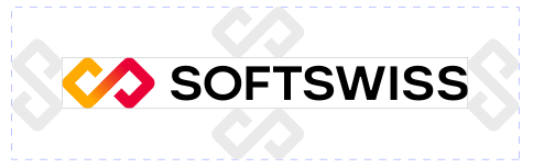
The minimum clear space around the logo must be equal to the width of the logo symbol.
The two-color logo version is used in cases where reproducing the primary logo version is not possible.

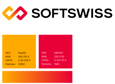
The one-color logo version is used in cases where reproducing either the primary or the two-color logo version is not possible.
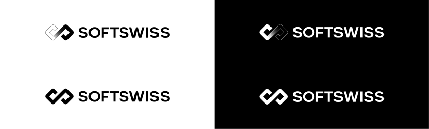
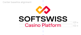
The logo with descriptor has two alignment options: left baseline alignment and center baseline alignment.
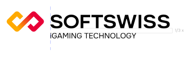


Sub-brand names are set in TT Turns Medium and can be aligned either to the left baseline or the center baseline.
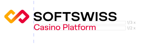








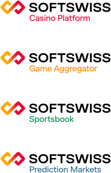
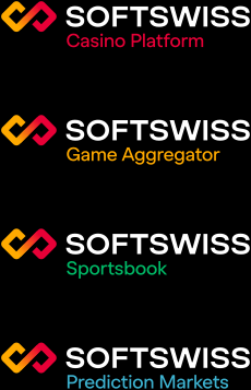
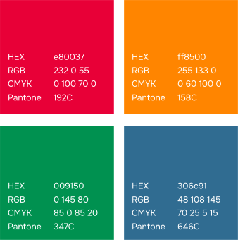
Separate color variations of the sub-brands are used for light and dark color schemes.
Both horizontal and vertical co-branding layouts are permitted.


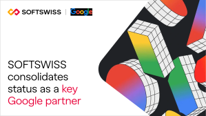
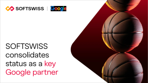
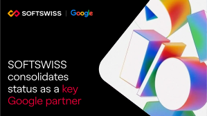
Depending on communication priorities, the diamond-shaped frame can contain either the partner’s visual assets or SOFTSWISS visual assets.
The diamond-shaped frame is intended for communications where the partner's visual assets take priority.
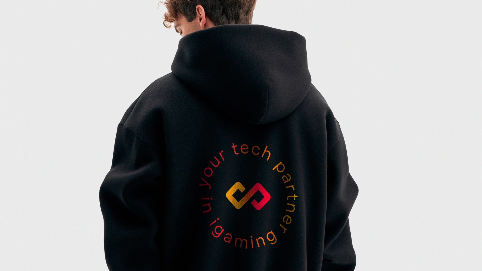
The short logo version consists of the graphic symbol only. It is intended for use in icons, favicons, avatars, and merchandise.


Ensure the logo remains legible when used at minimum sizes.





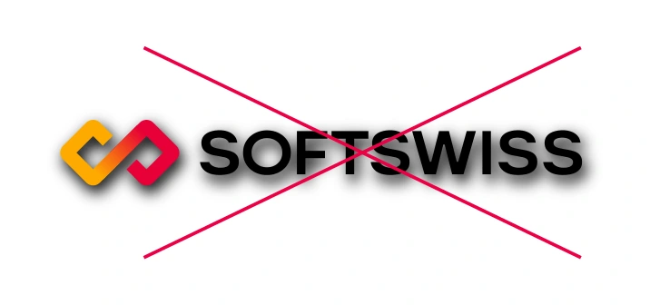

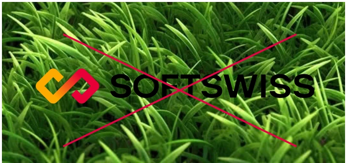

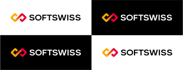
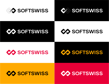
The main rule is to place the logo on a high-contrast background.

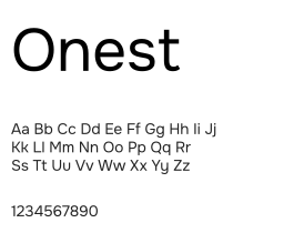
The Onest typeface is used for large blocks of text.
Style: Light, Regular, Medium, Semibold, Bold.
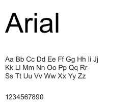
Arial is used as an alternative typeface only when Onest cannot be applied for technical reasons. Arial must not be used in external communications.
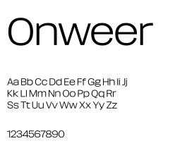
Onweer is the primary display typeface and is used for large headlines.
Style: Normal Wide Light.
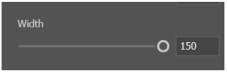
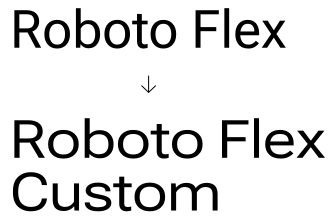
As an alternative to Onweer, use the free Roboto Flex typeface. To give it a more distinctive display character, use the Custom style with the Width setting set to 150.
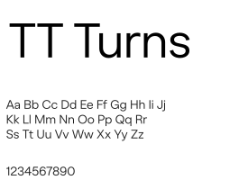
Aa Bb Cc Dd Ee Ff Gg Hh Ii Jj Kk Ll Mm Nn Oo Pp Qq Rr Ss Tt Uu Vv Ww Xx Yy Zz
1234567890
TT Turns is used for headlines, subheadings, and short blocks of text.
Style: Regular.
Recommended text settings may vary depending on the layout. Each subsequent text level should be approximately half the size of the previous one.
Leading 110–120%
Font size 36 pt
Leading 100–110%
Font size ≤18 pt
Leading 120–140%
Font size ≤9 pt

Two types of text alignment are used: left-aligned (preferred) and centered (at the designer’s discretion).



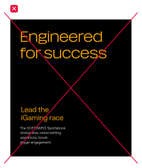
Use color to highlight only one key message in the layout.
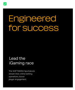
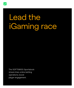
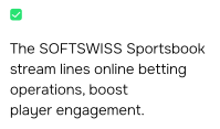
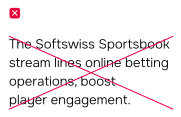
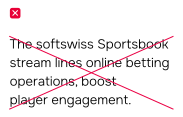
The brand name must always be written in uppercase in all text materials.
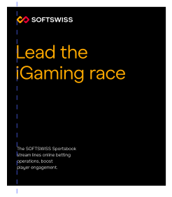
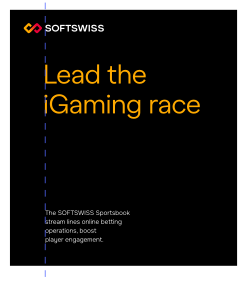
In layouts, text blocks may be aligned either with the logo symbol or with the SOFTSWISS wordmark.
The icons are created in a consistent linear style featuring a uniform stroke weight, closed contours, geometric shapes, and a balance of sharp and rounded corners. The icon system can be expanded with new symbols, provided they follow the established visual language.
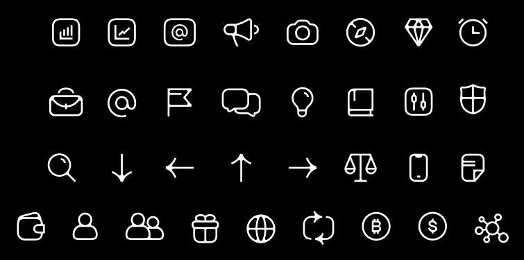
The icon stroke weight depends on the size of the application and is defined by the designer individually. Inner parts of the icons should have rounded corners.




The main rule is to place the logo on a high-contrast background.




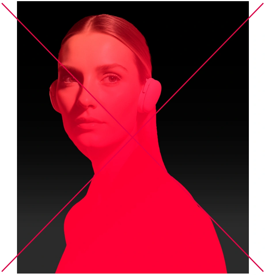
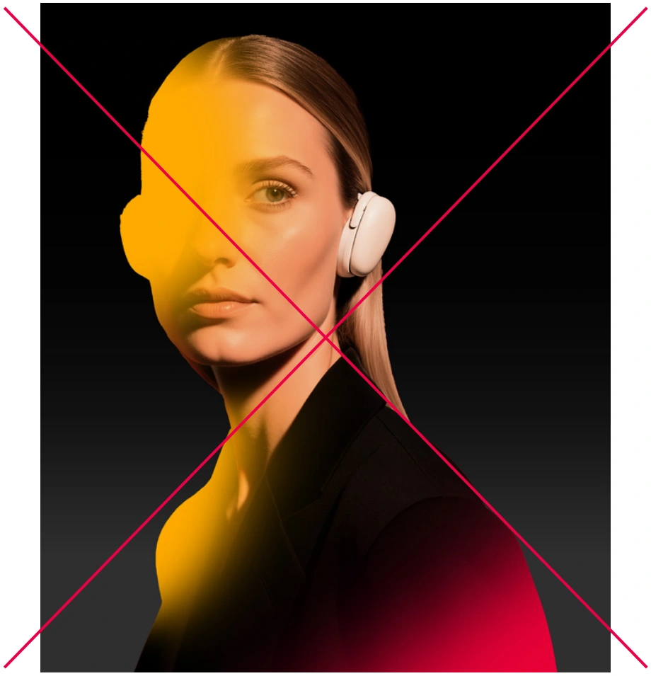
The brand gradient can be overlaid on an object as a mask or used as a background element.
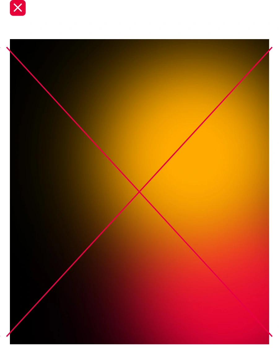
The master brand uses yellow and red gradients.


Examples of master brand gradients used on dark and light backgrounds.
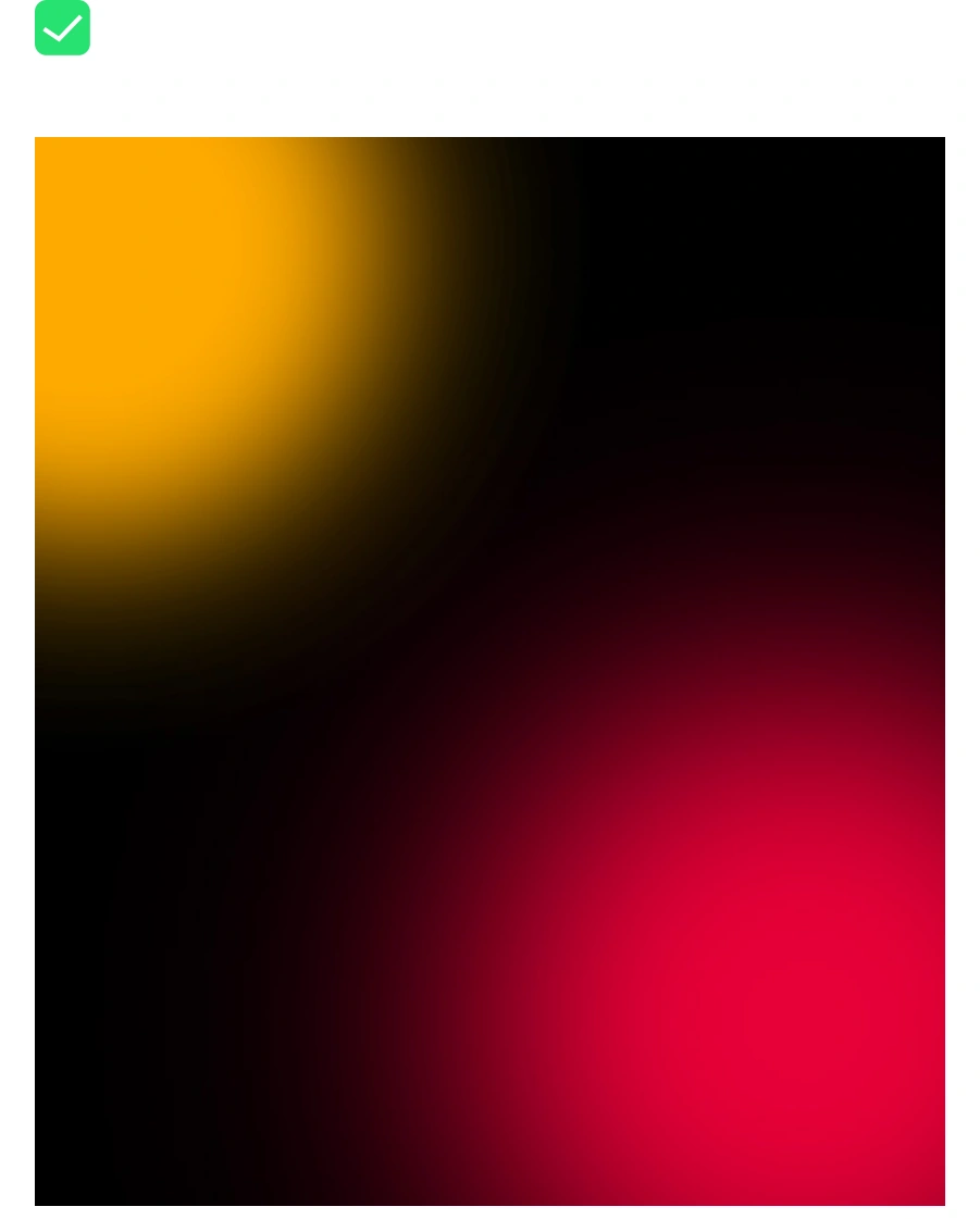
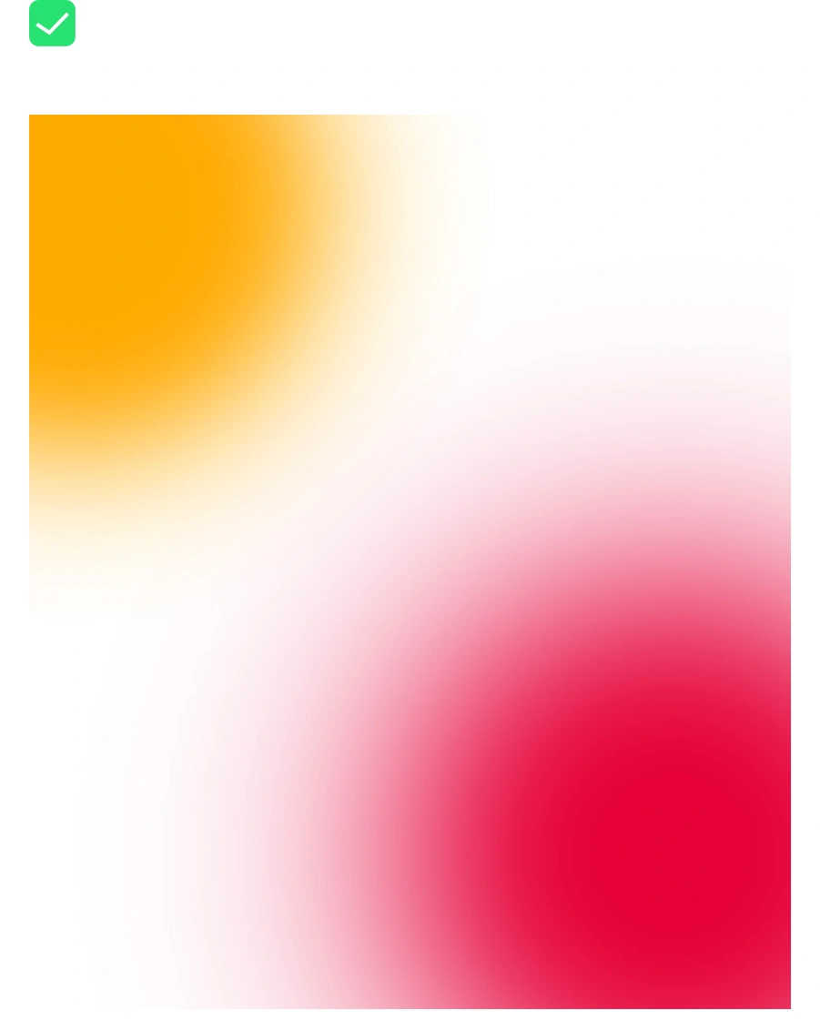
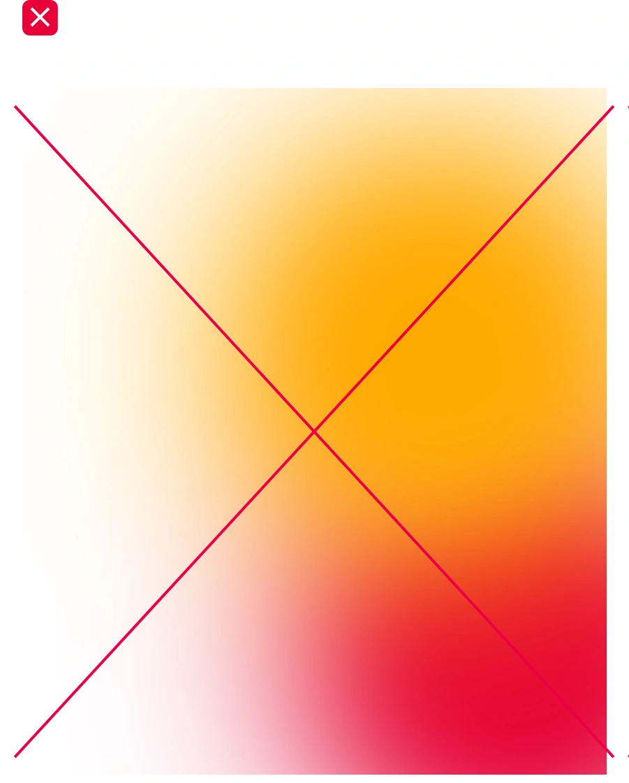
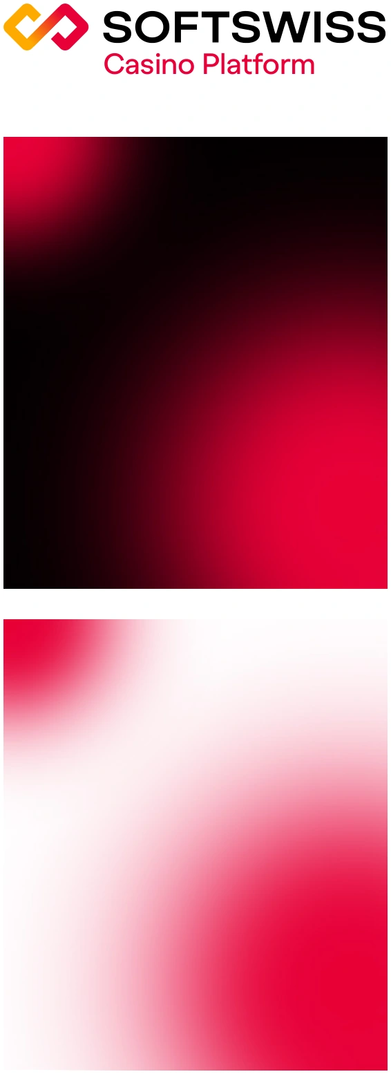
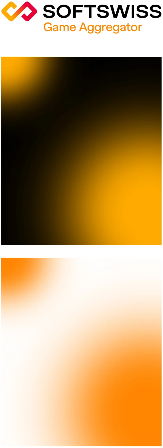
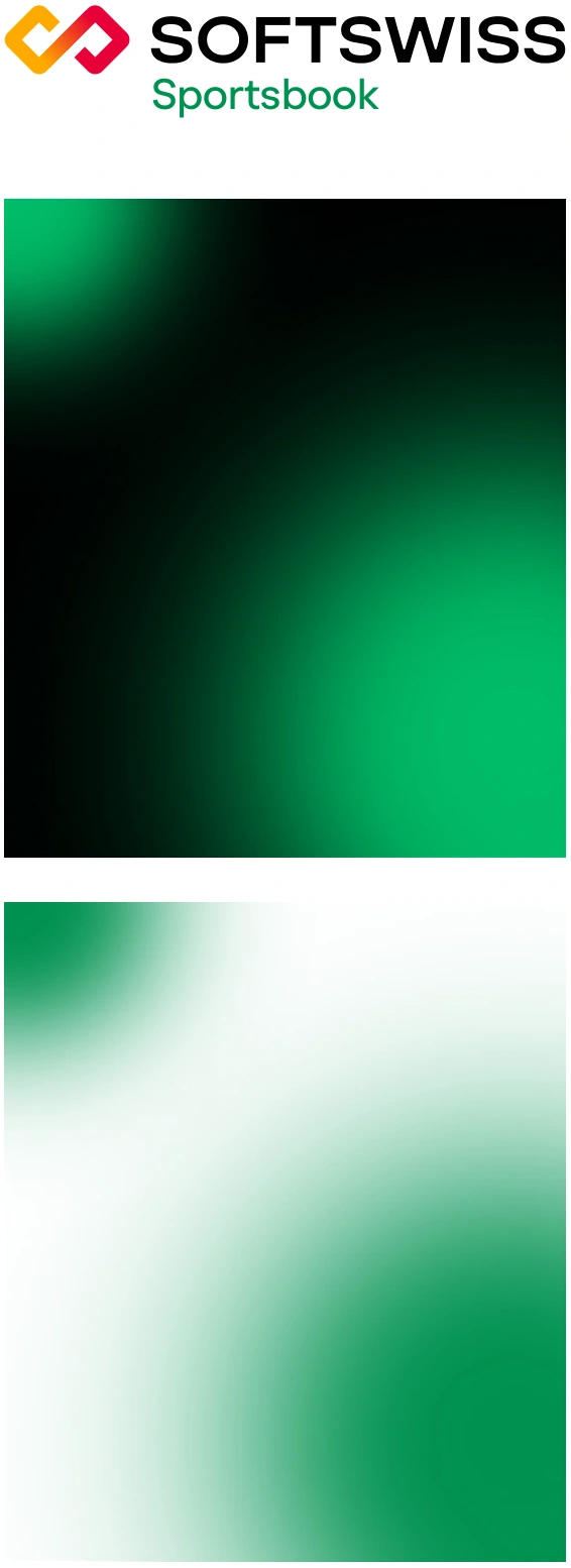
Sub-brand gradients are monochromatic and use the corresponding sub-brand colors.




Examples of sub-brand gradients on dark and light backgrounds. A single gradient or multiple gradients may be used.
Gradient colors follow the corresponding dark and light color schemes.
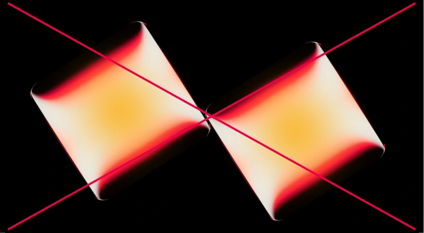
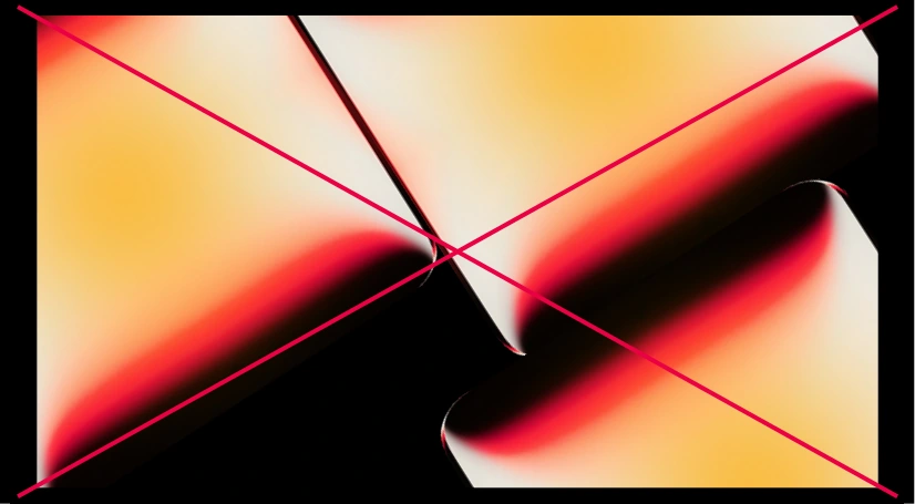
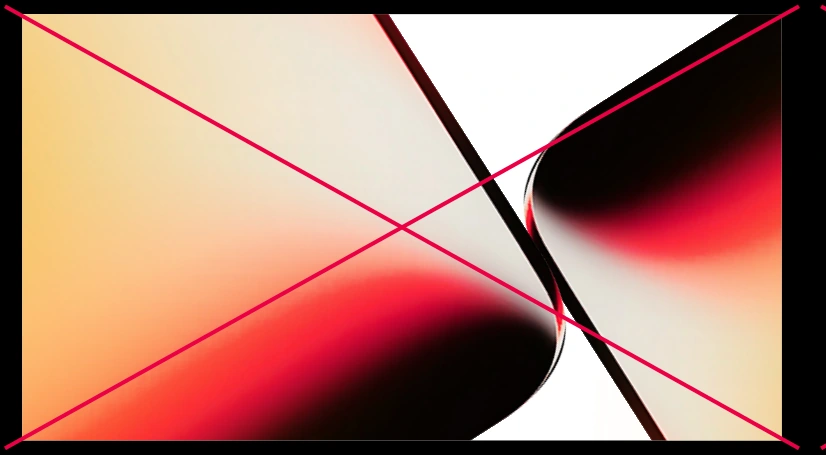
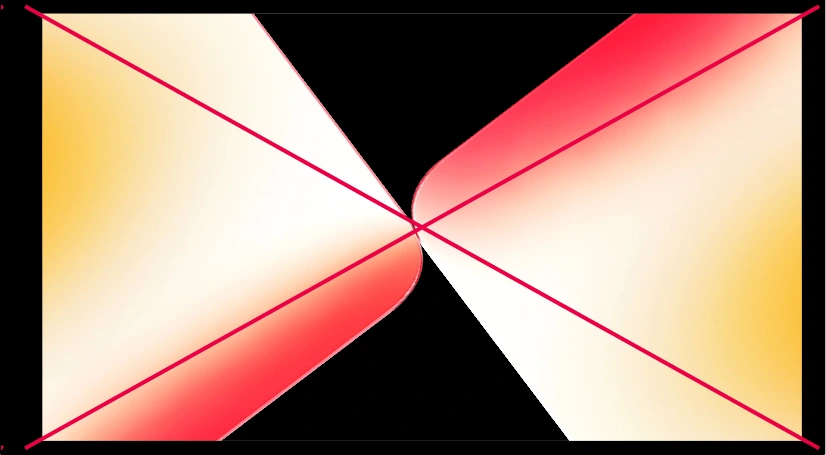
The brand’s graphic elements are rounded-corner diamond shapes rendered in a glossy three-dimensional style. Smooth gradient transitions and soft highlights create a sense of depth.
Designers may create new diamond variations while maintaining the established visual style.
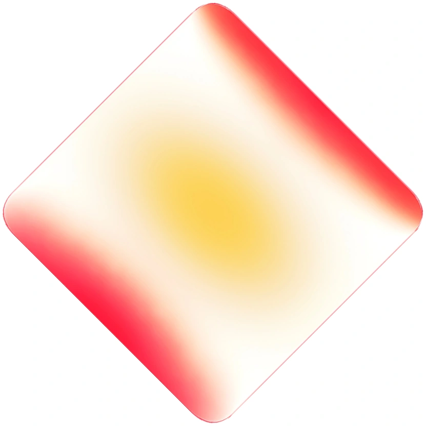
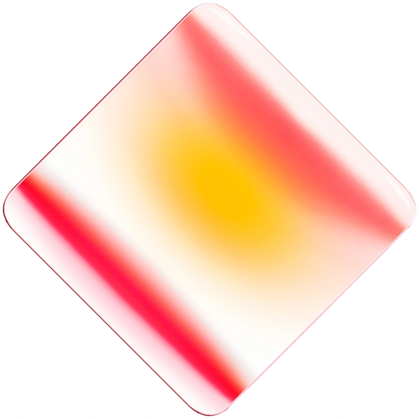
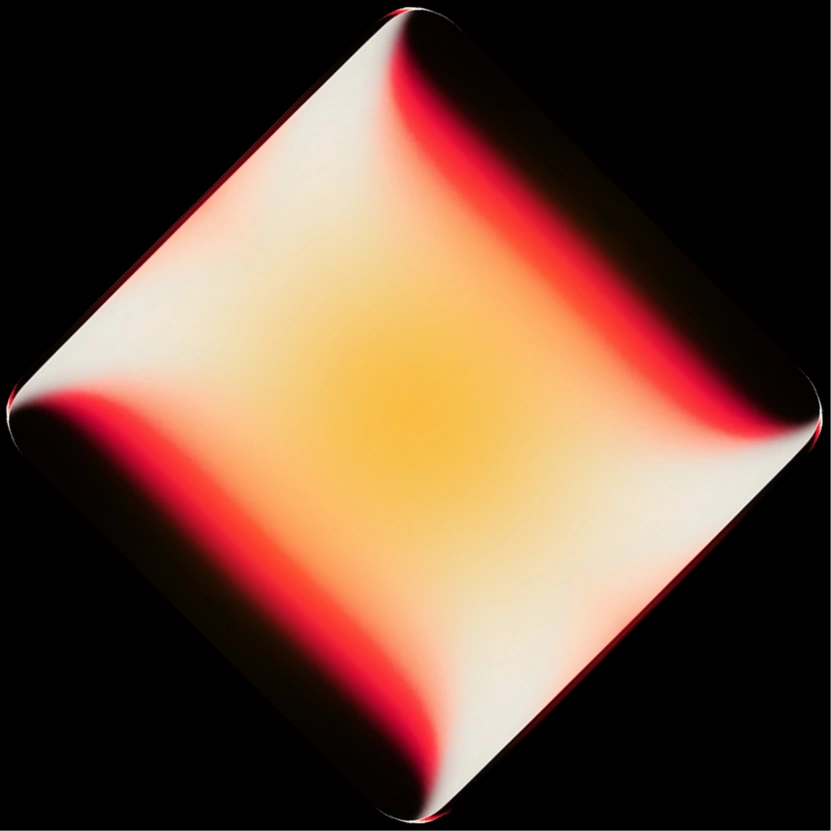
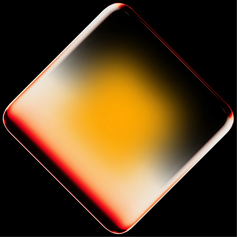
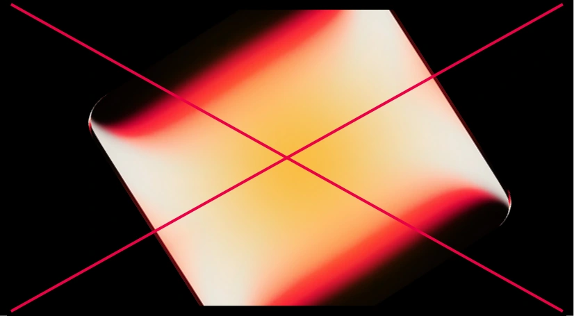
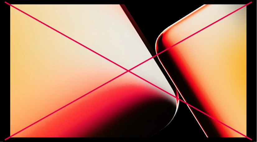
Brand diamonds are used only as part of compositions, symbolizing interaction and connection. Different composition solutions are allowed, but all diamonds within a single composition must be identical.
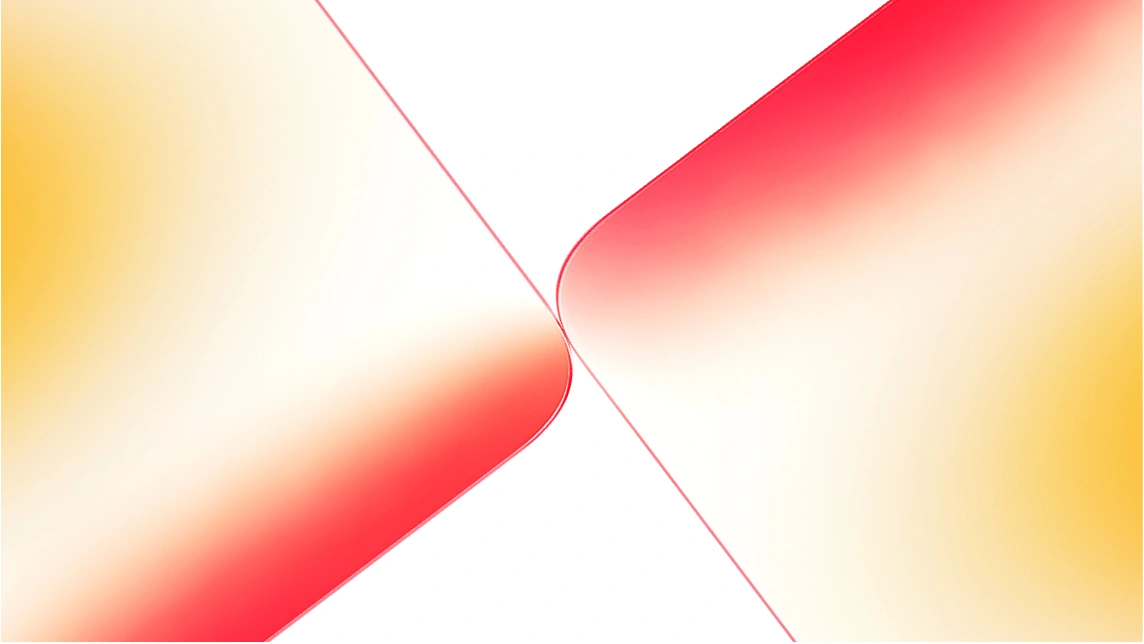
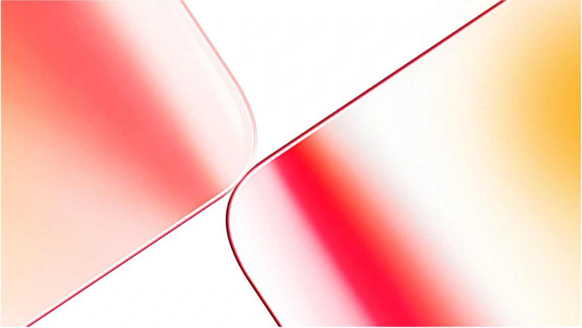
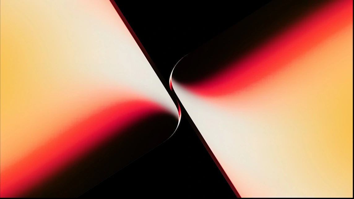
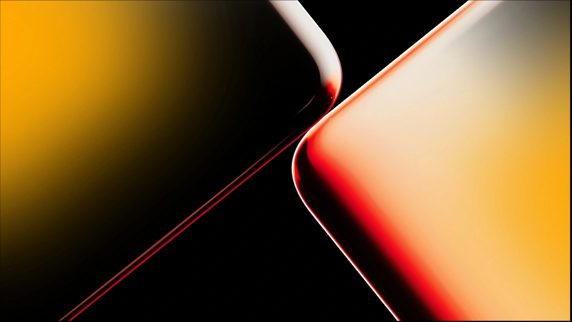
Gradient transitions within the brand elements are not fixed and may vary depending on the application.
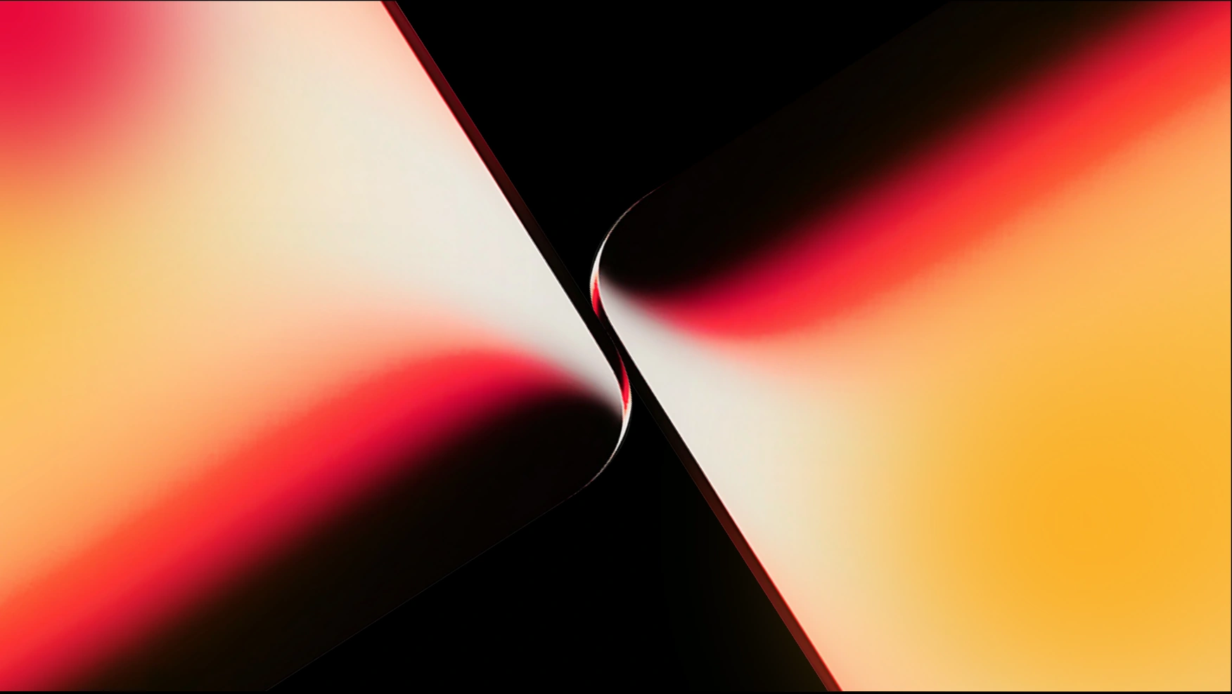
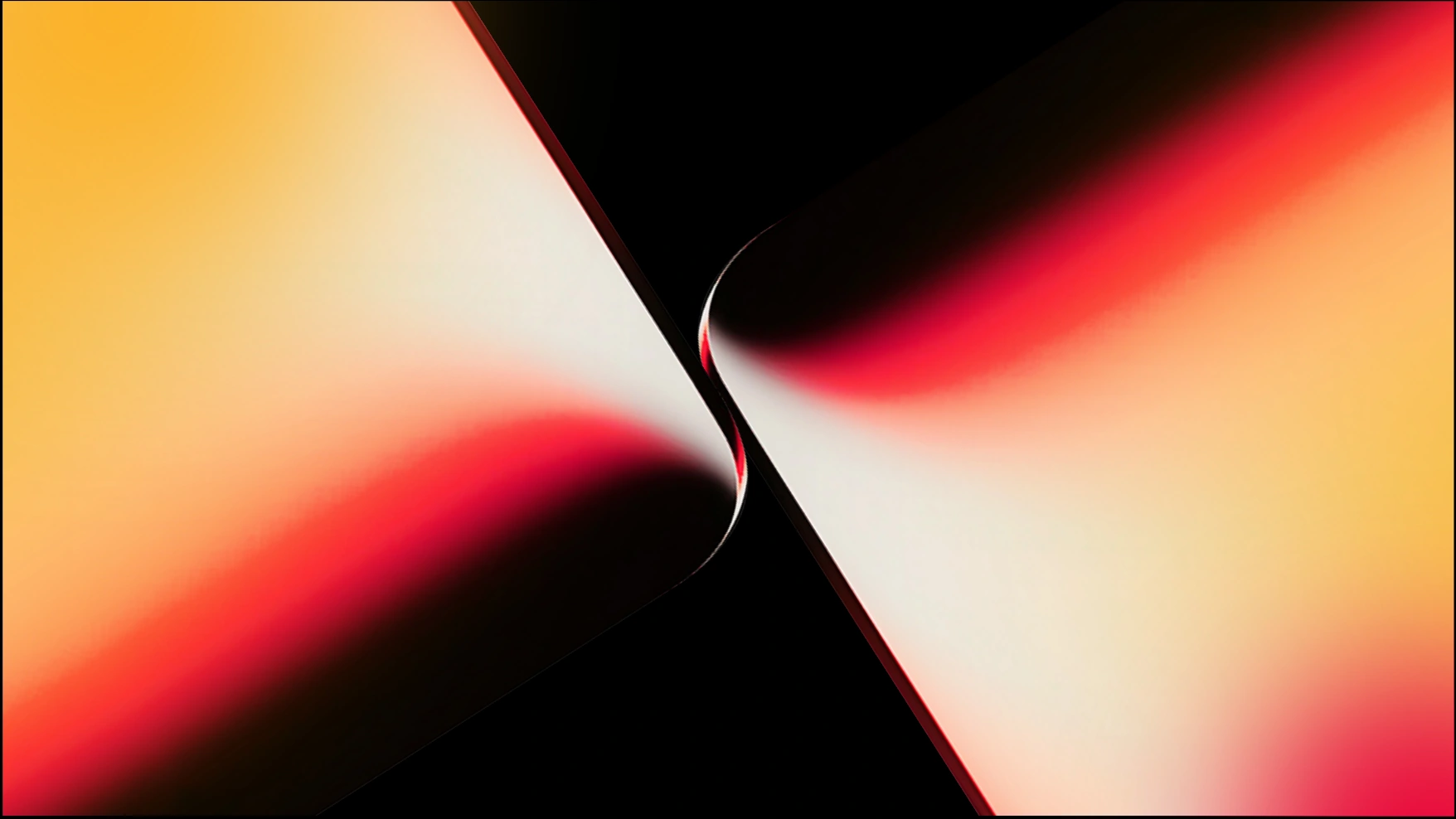
Compositions may be freely cropped and rotated to any angle depending on the format and requirements of the medium.
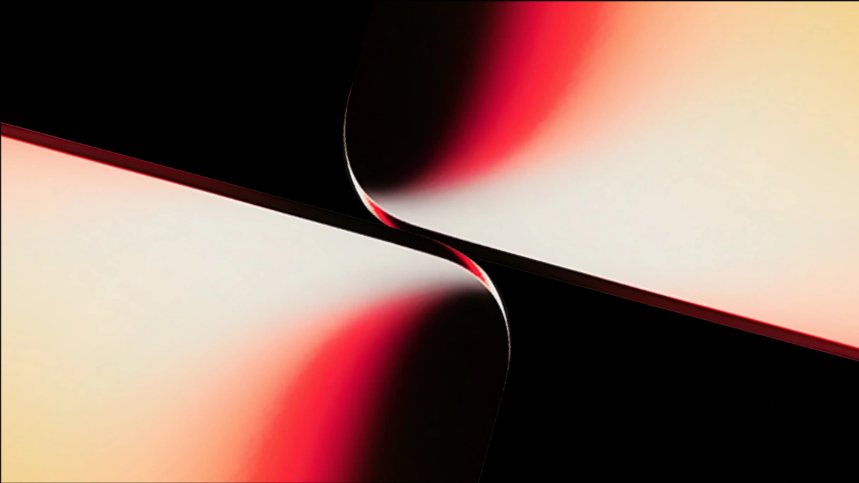
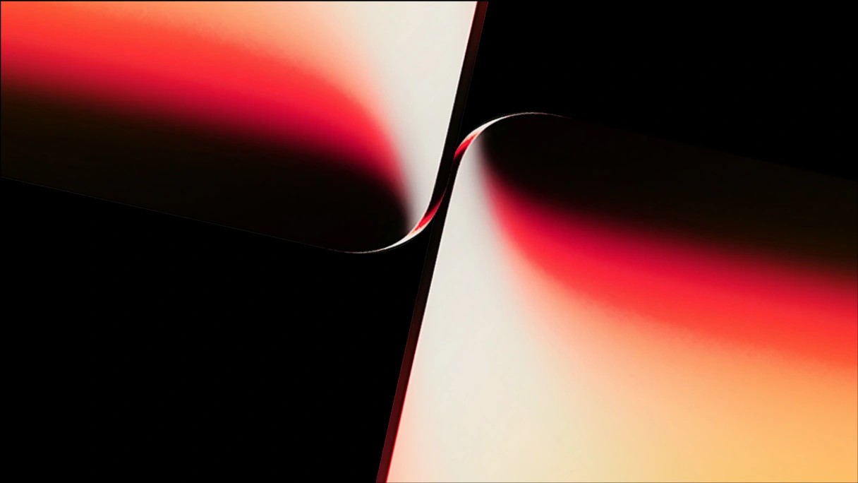
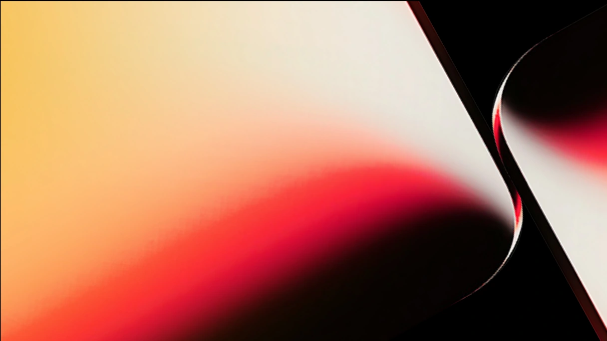
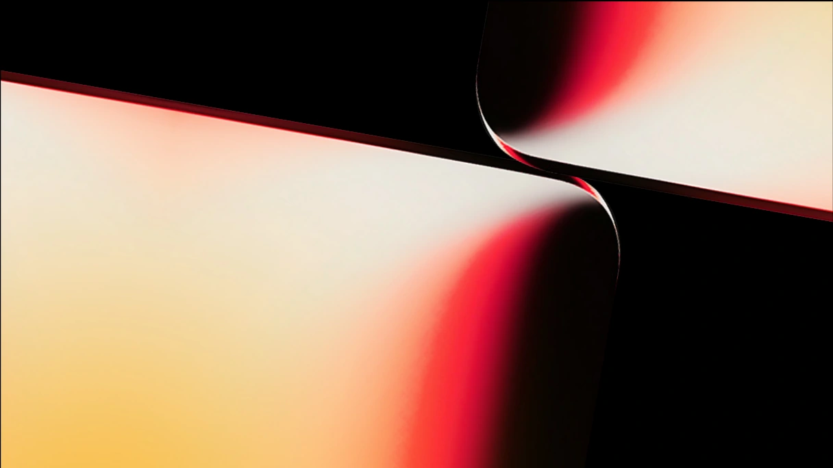
Crop and position the brand elements so they do not interfere with the text and maintain good legibility.
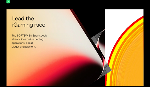
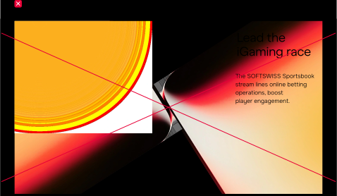
When creating materials for sub-brands, the brand graphic elements use the corresponding sub-brand color scheme — light or dark.
The master brand uses two-color gradients (red and yellow), while sub-brands use monochromatic color treatments.
Dark scheme
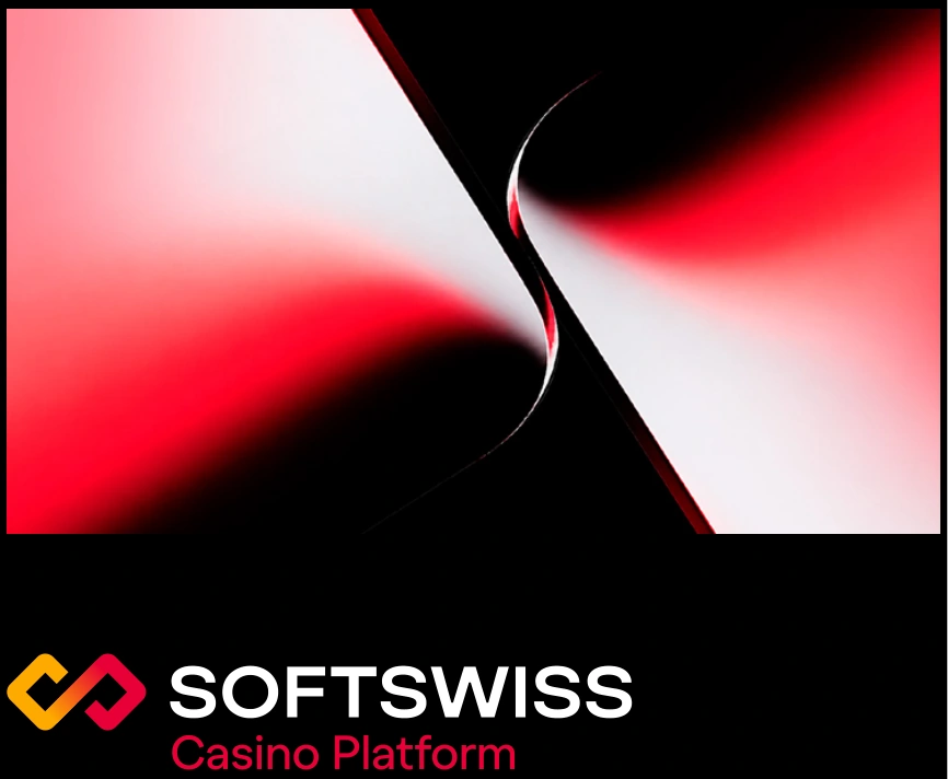
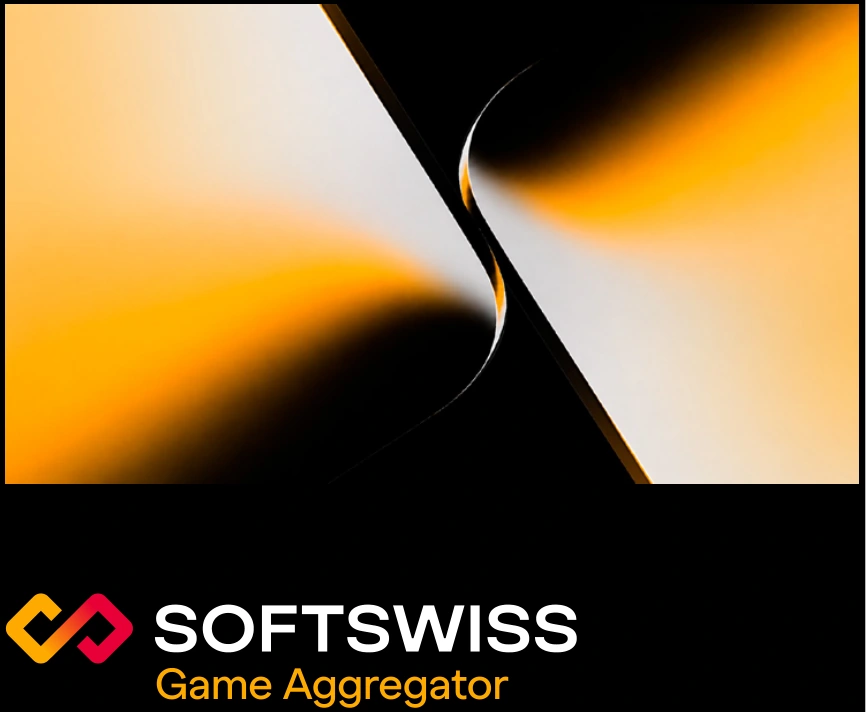
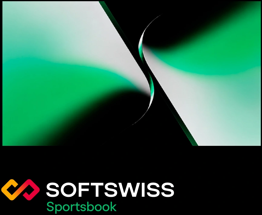

When creating materials for sub-brands, the brand graphic elements use the corresponding sub-brand color scheme — light or dark.
The master brand uses two-color gradients (red and yellow), while sub-brands use monochromatic color treatments.
Light scheme
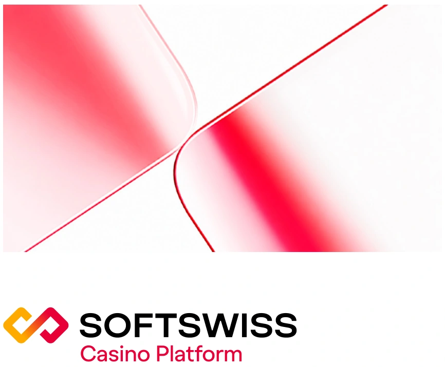

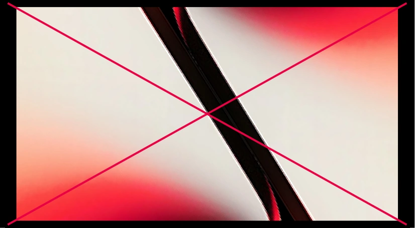
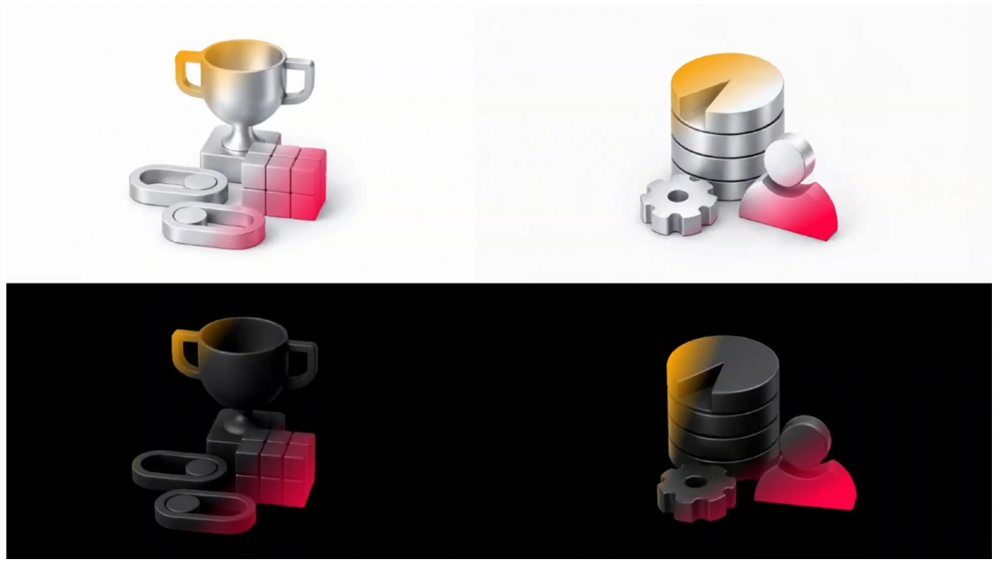
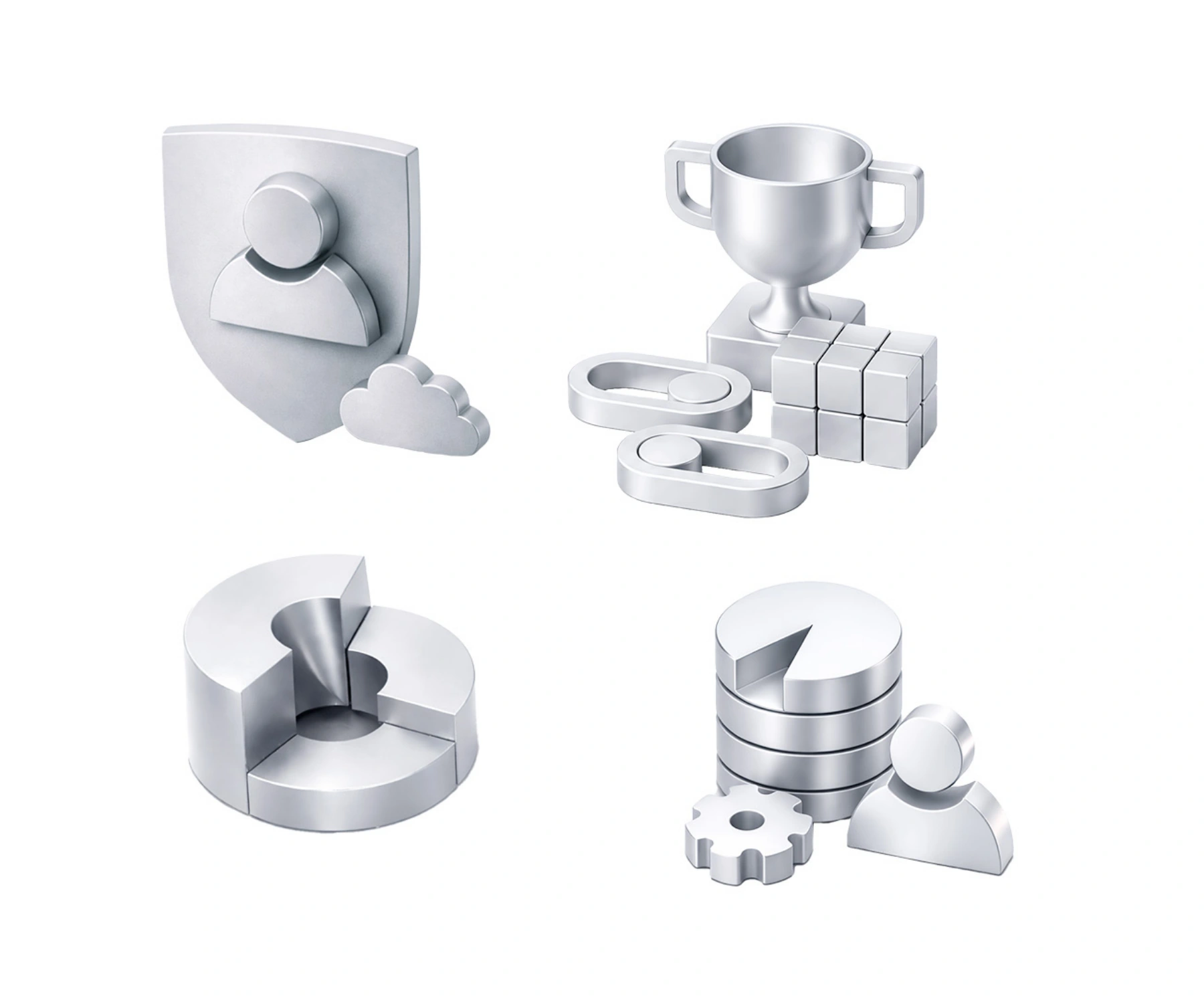
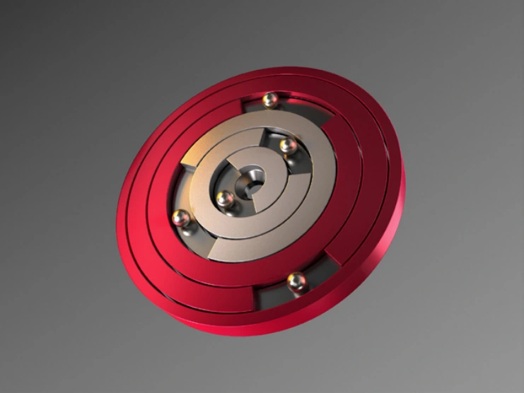
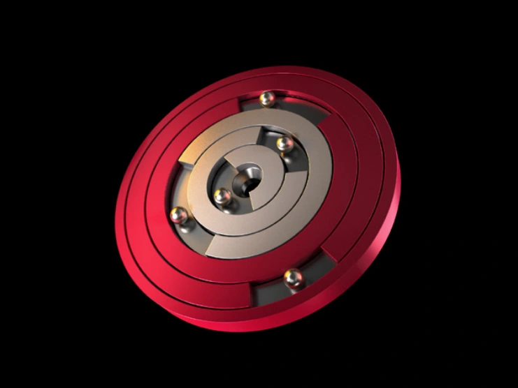
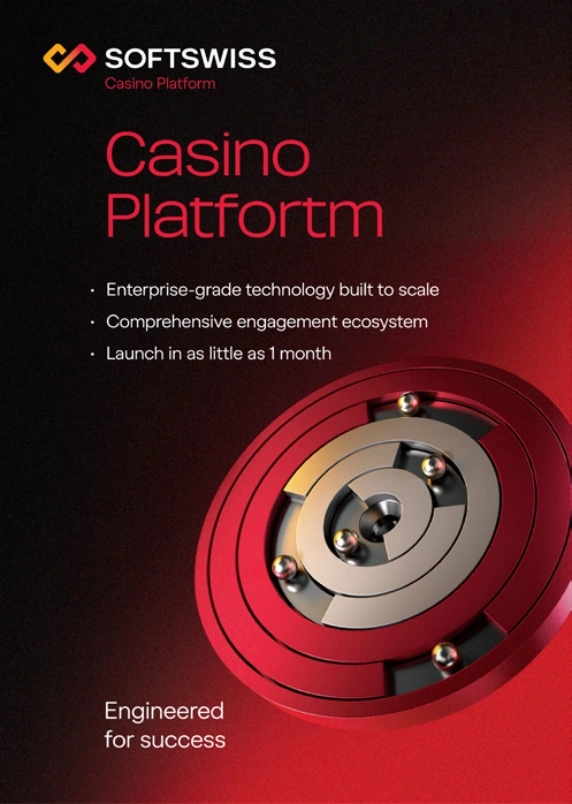
The icons are designed in a 3D style with a matte metallic material. Lighting is soft and diffused, with no cast shadows. Simple geometric shapes and smooth rounded edges are used throughout.
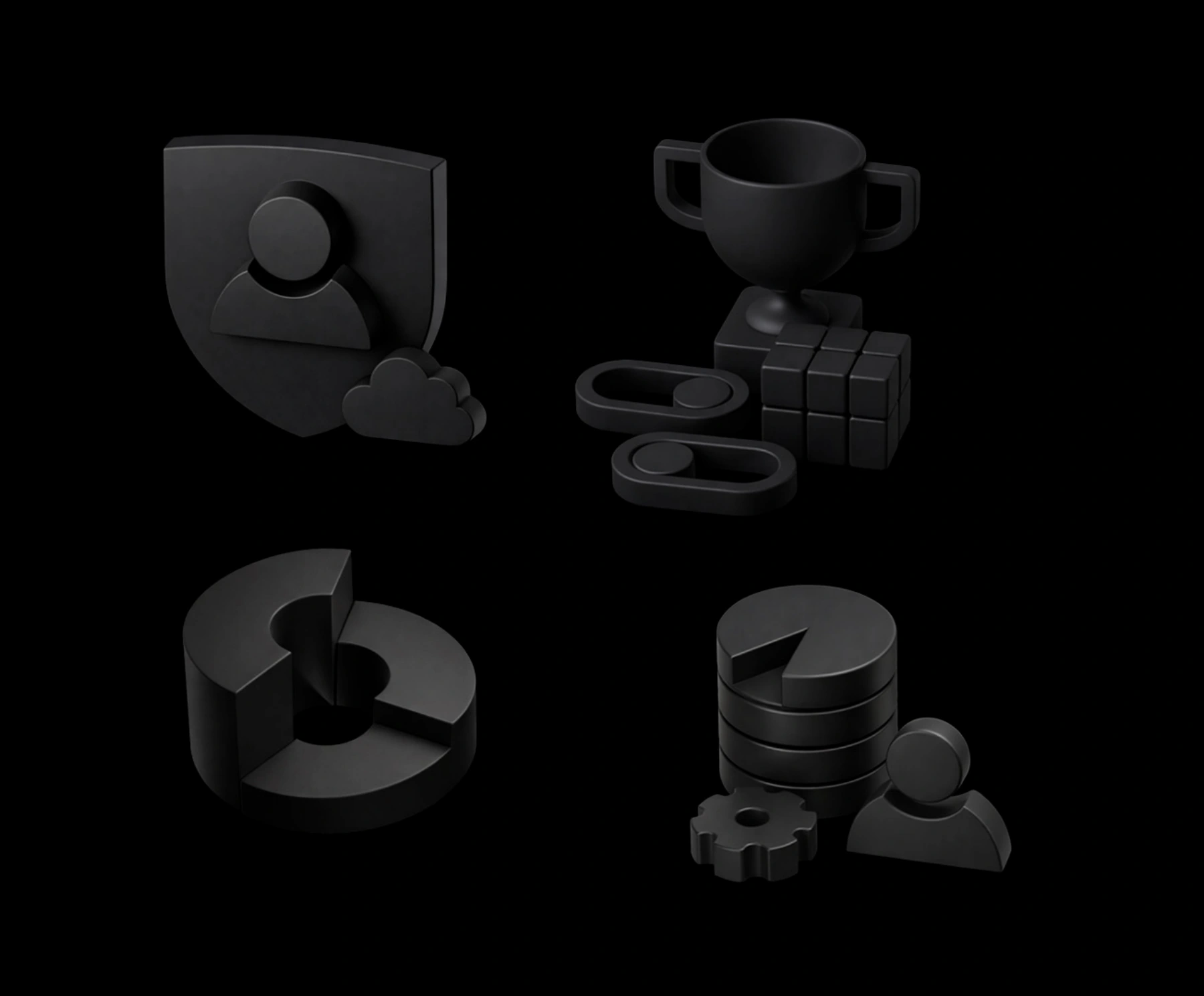
Brand gradients may be applied to the icons.
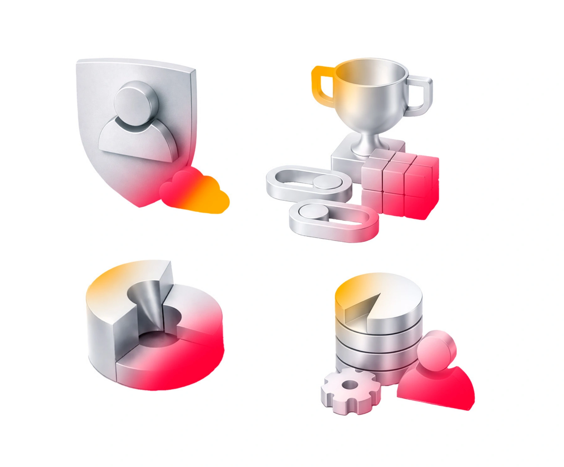
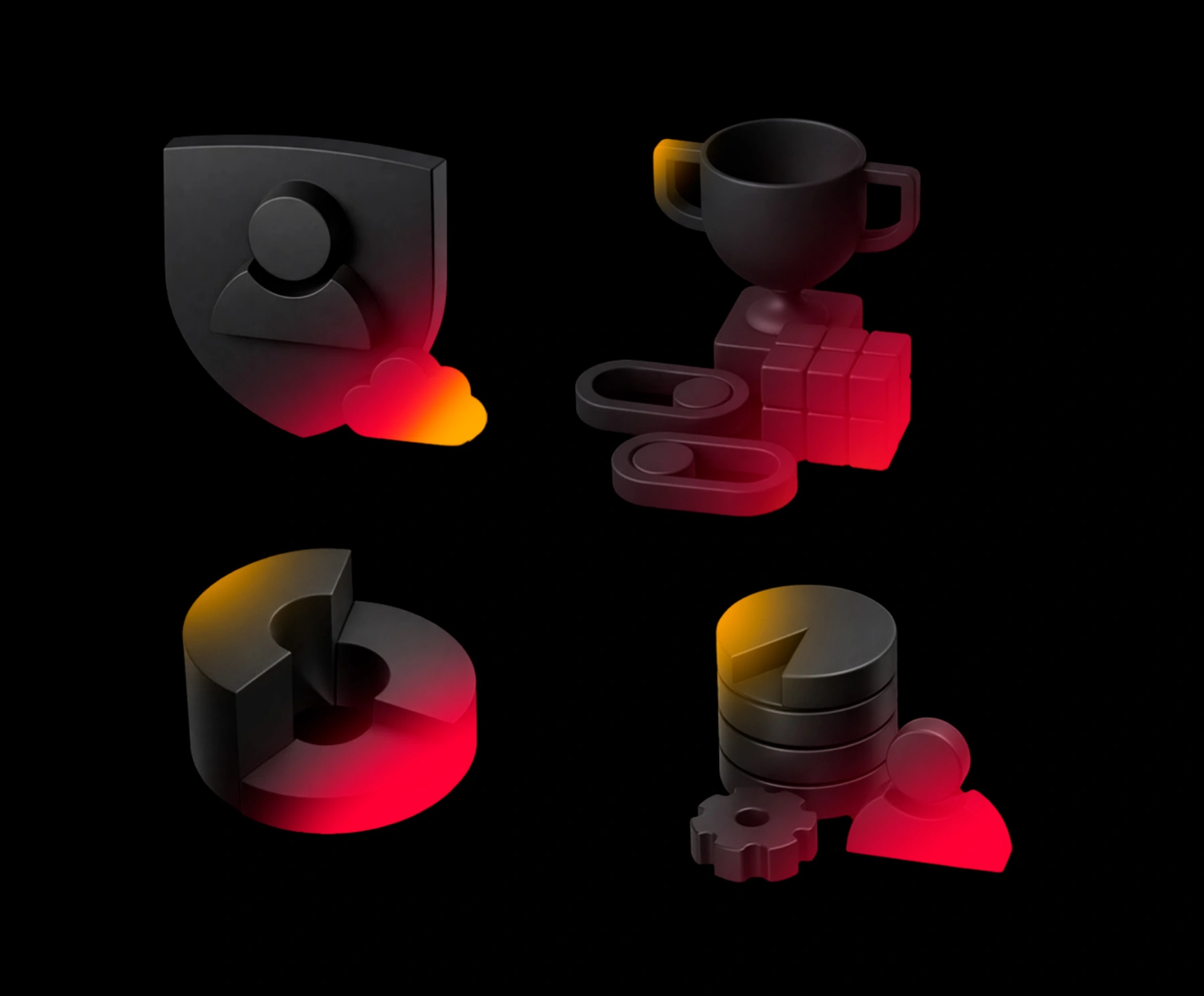
Icons may be placed on backgrounds that correspond to their color scheme, or on gradient backgrounds.
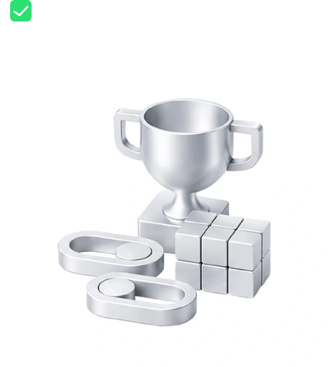

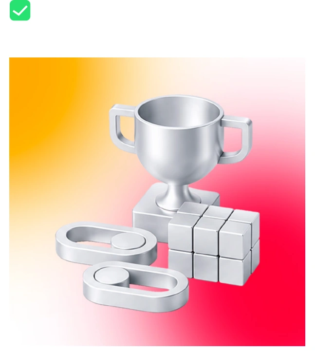
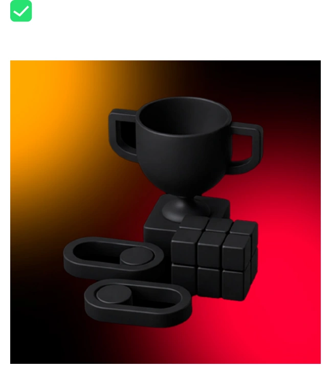
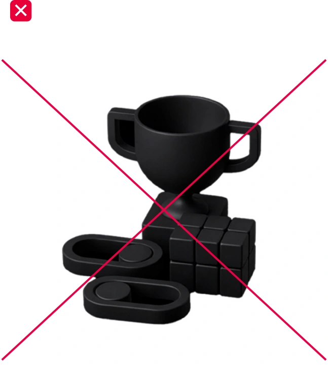
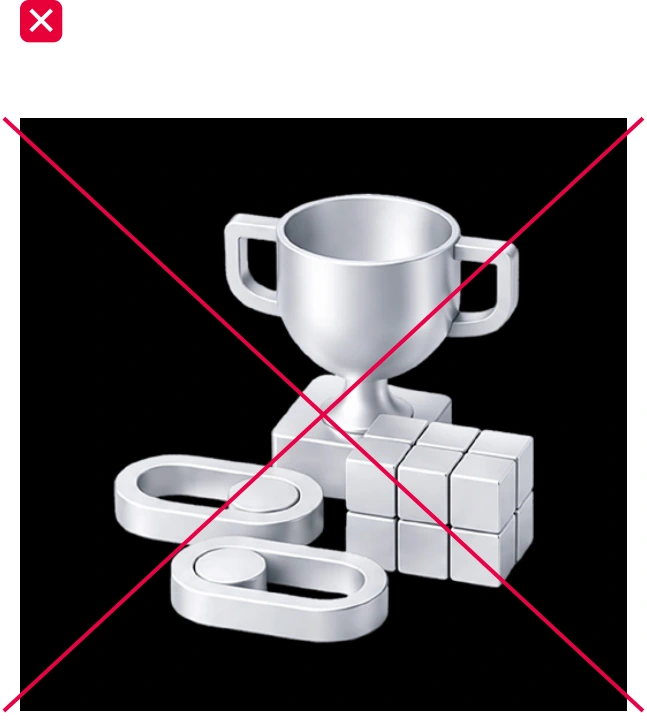
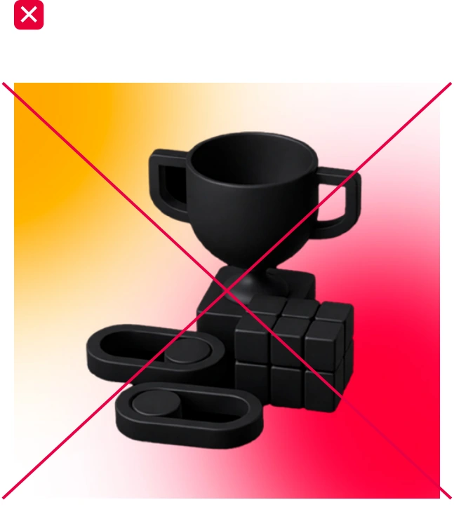
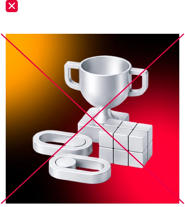
Gradients may be applied both to objects and used as backgrounds. When using gradients, make sure all elements of the brand icons remain clearly visible.
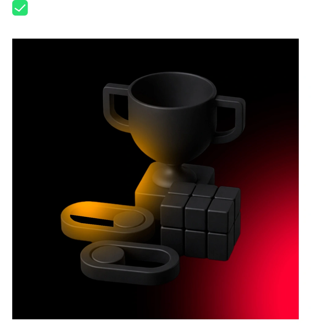
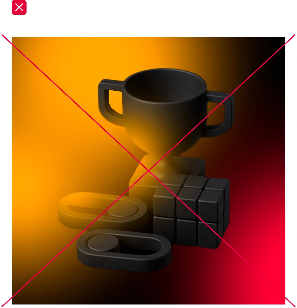
[Object], minimalist 3D icon, simple geometric shapes with soft rounded edges, matte silver metal material, smooth clean surface, subtle metallic reflections. Soft diffused studio lighting, no harsh shadows, minimal ambient occlusion. Light neutral background, monochrome palette, clean premium CGI render, slightly isometric 3/4 view, minimal details, no text, no extra objects.
[Object], minimalist 3D icon, simple geometric shapes with soft rounded edges, matte dark metal material, smooth clean surface, subtle metallic reflections. Soft diffused studio lighting, no harsh shadows, minimal ambient occlusion. Dark black background, monochrome dark palette, clean premium CGI render, slightly isometric 3/4 view, minimal details, no text, no extra objects.
Previously developed sub-brand icons may be used when it is not possible to create new ones in the style described above.
The icon uses a single-color treatment and may be placed on different backgrounds. To ensure harmonious integration into the composition, highlights and reflections may be adjusted to match the surrounding colors.
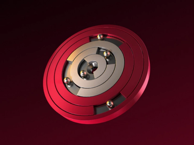
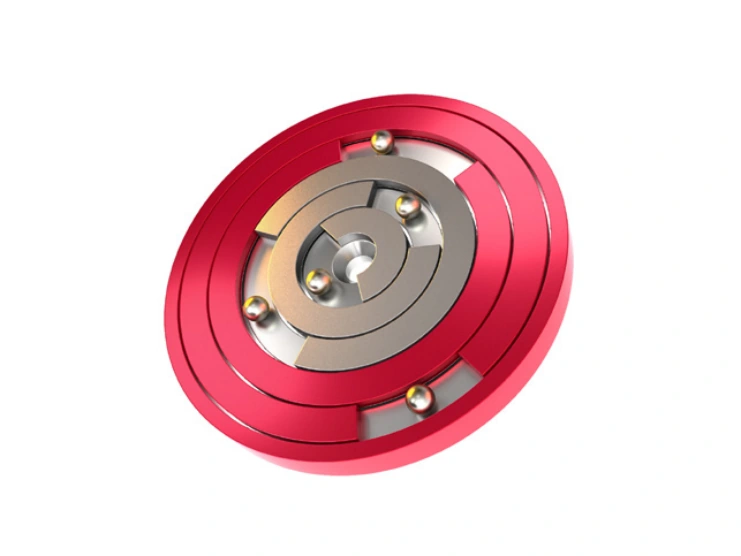

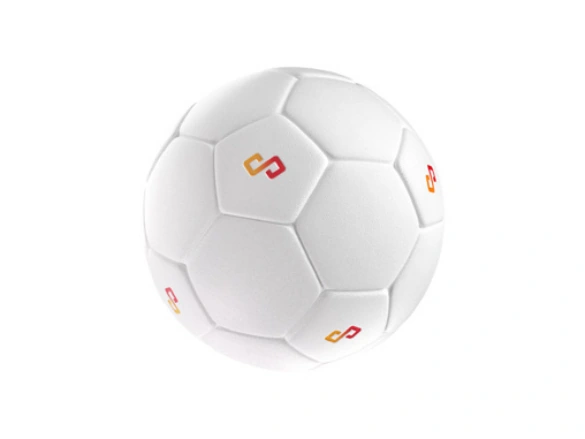
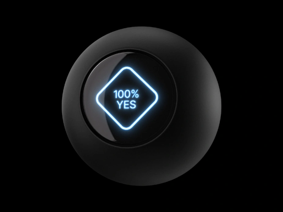
The branded ball is available in three versions: all-white, all-black, and black-and-white. The white version is used only on light backgrounds, while the black version is used only on dark backgrounds. The black-and-white version is universal and may be used on any background.
To ensure harmonious integration into the composition, highlights and reflections may be adjusted to match the surrounding colors.
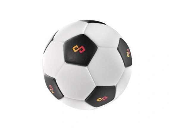
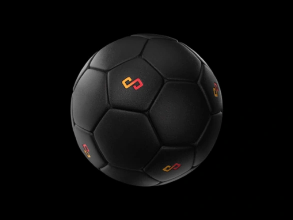
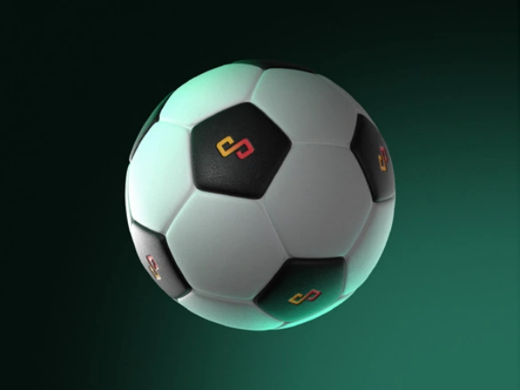
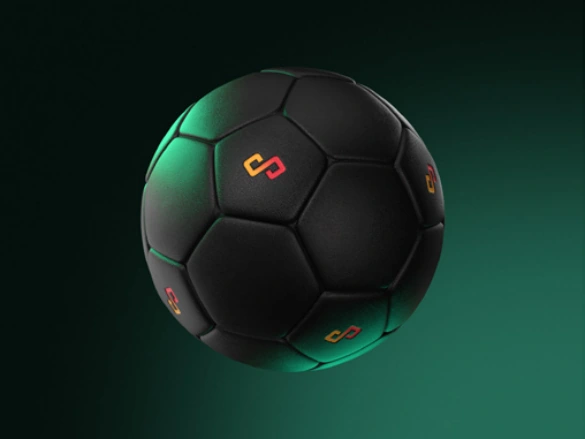
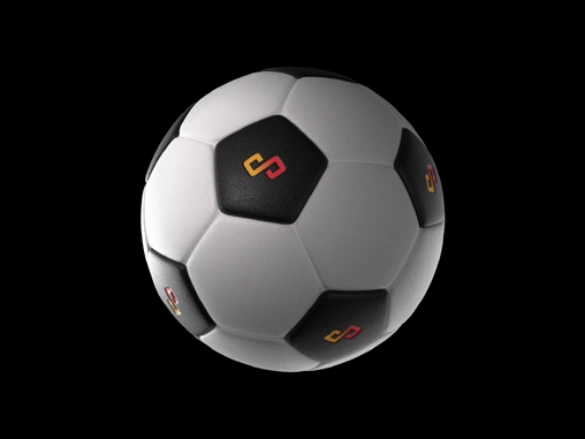
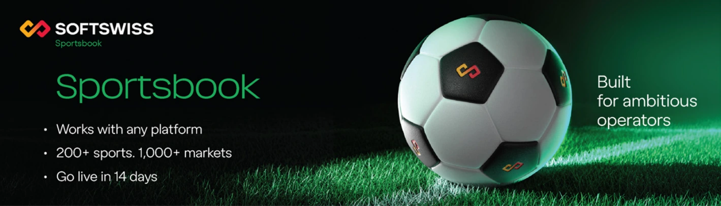
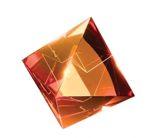
The icon is used in a single visual treatment and can be adapted to different backgrounds by adjusting highlights and reflections, allowing it to blend naturally into the surrounding environment.
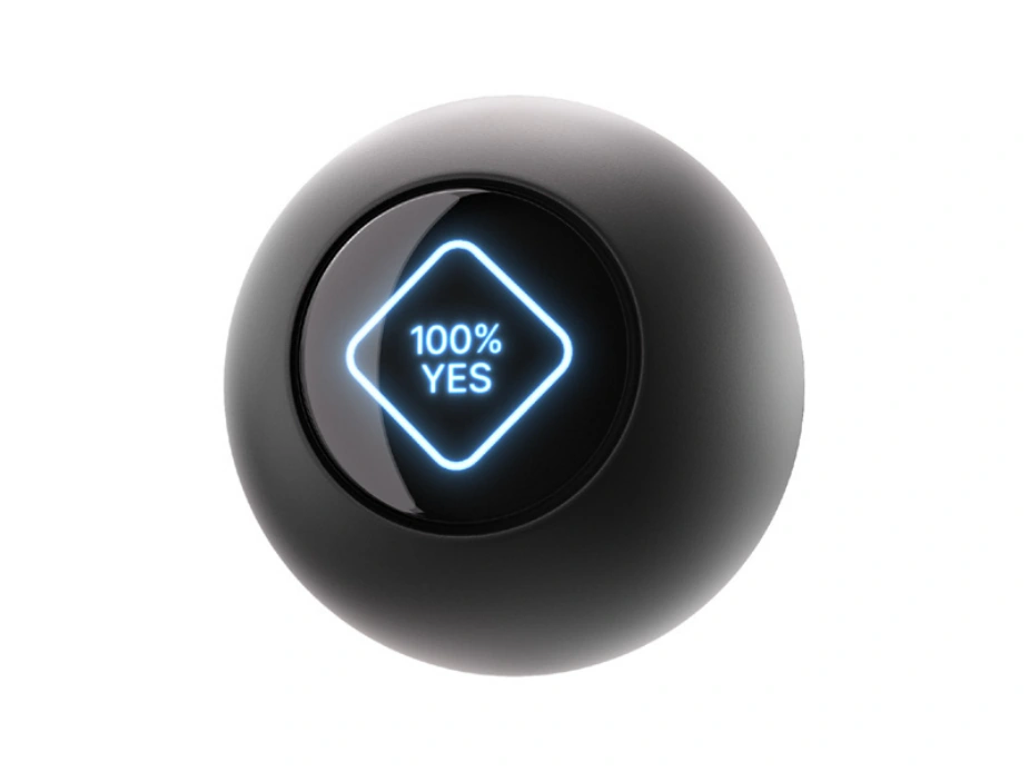
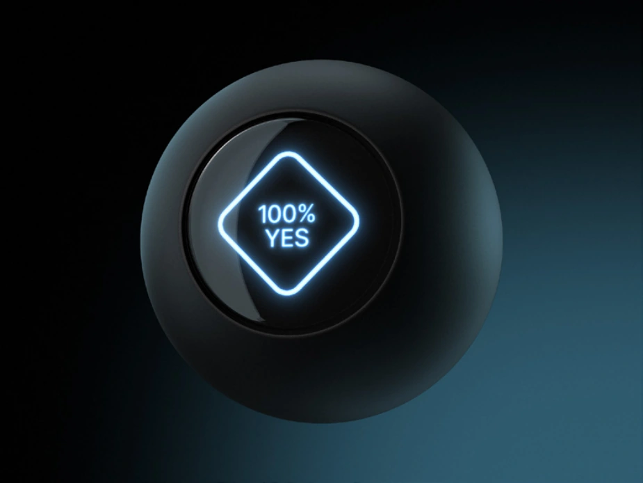
The icon may be used on any background. Since it is made of glass, its surface naturally changes color depending on the surrounding environment.
To integrate it harmoniously into the composition, adjust the glow and reflections around the object to match its surroundings.
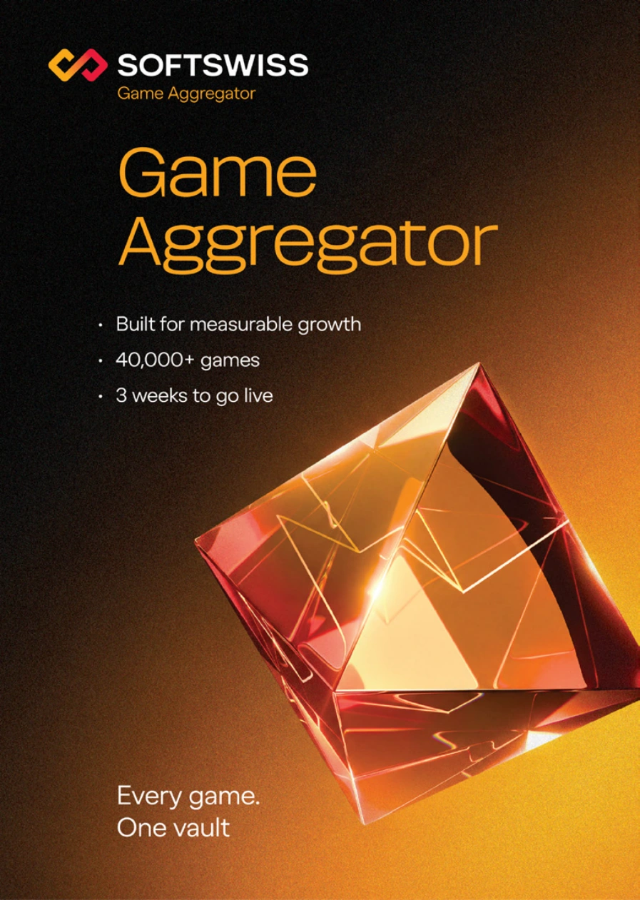
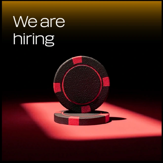
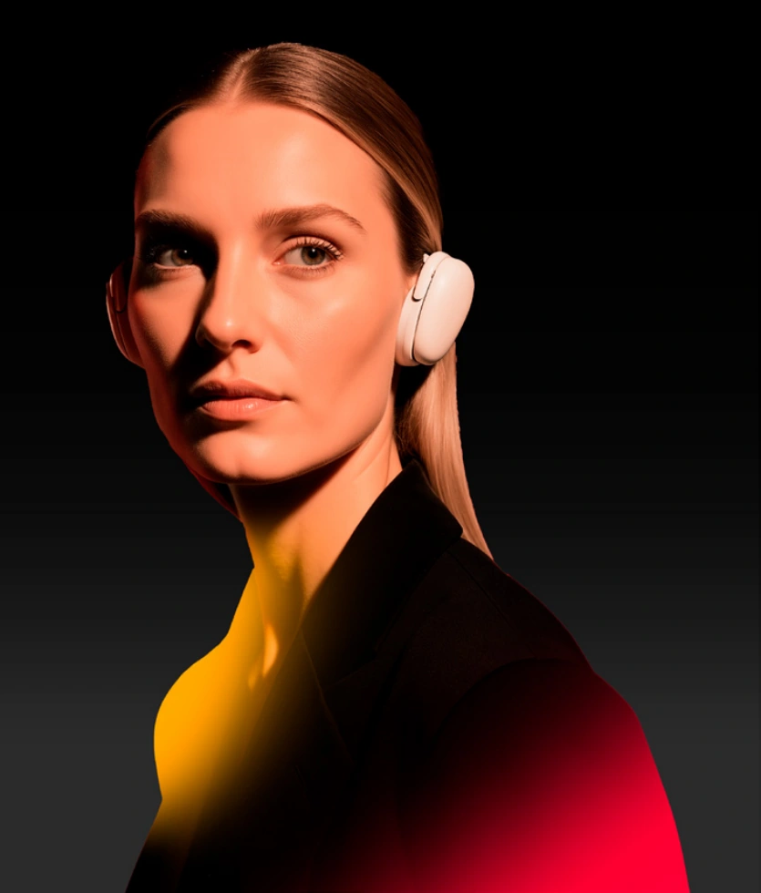
The photography style is built around high-contrast lighting and minimal compositions. Light is used as the primary visual tool.
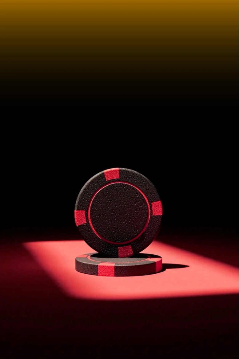

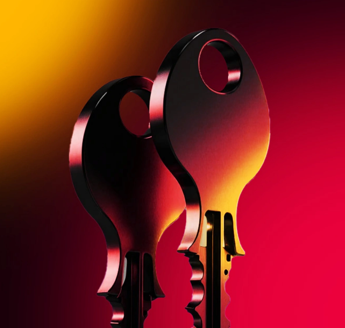
The photography style is based on high-contrast directional lighting. The key light creates depth while preserving deep shadows. Additional brand red and yellow light accents are used selectively to create colored reflections and reinforce the brand’s color system.
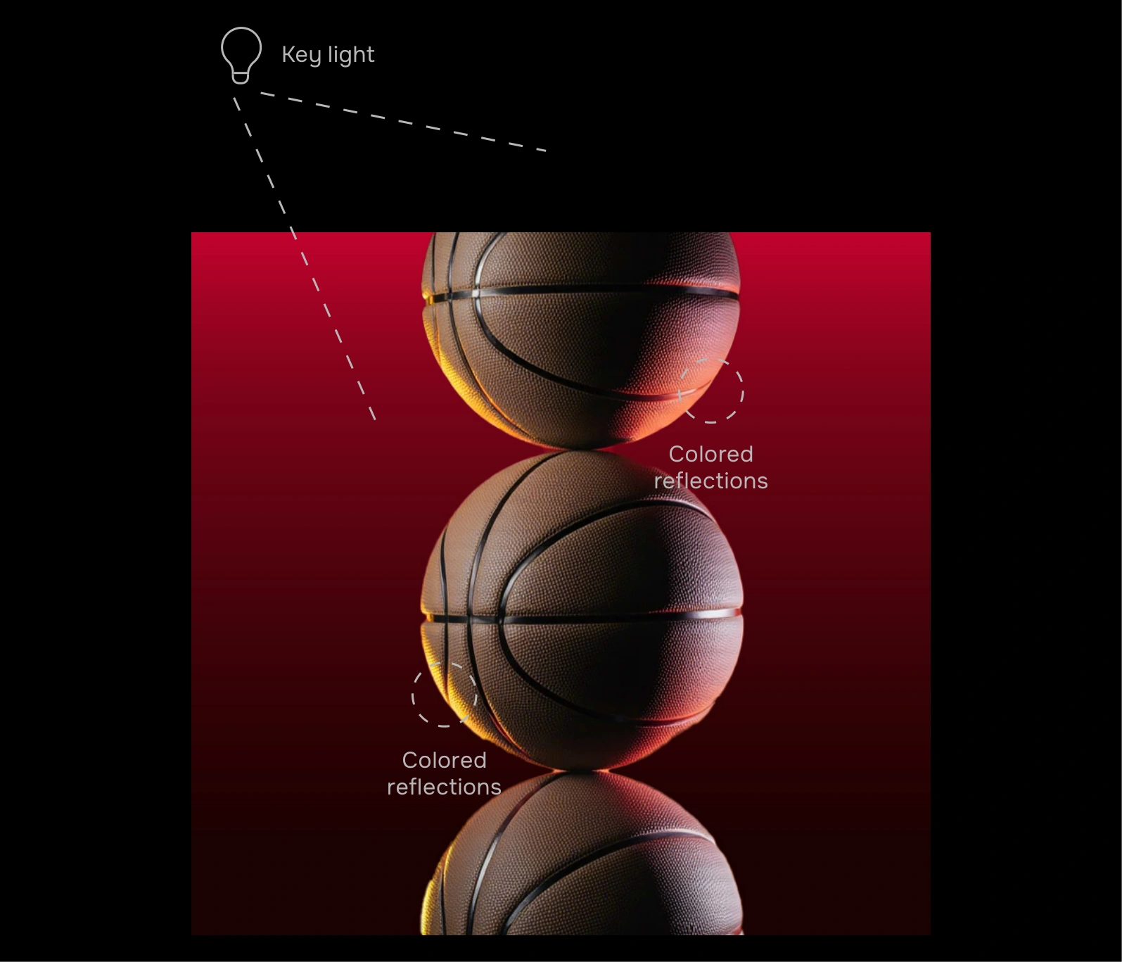
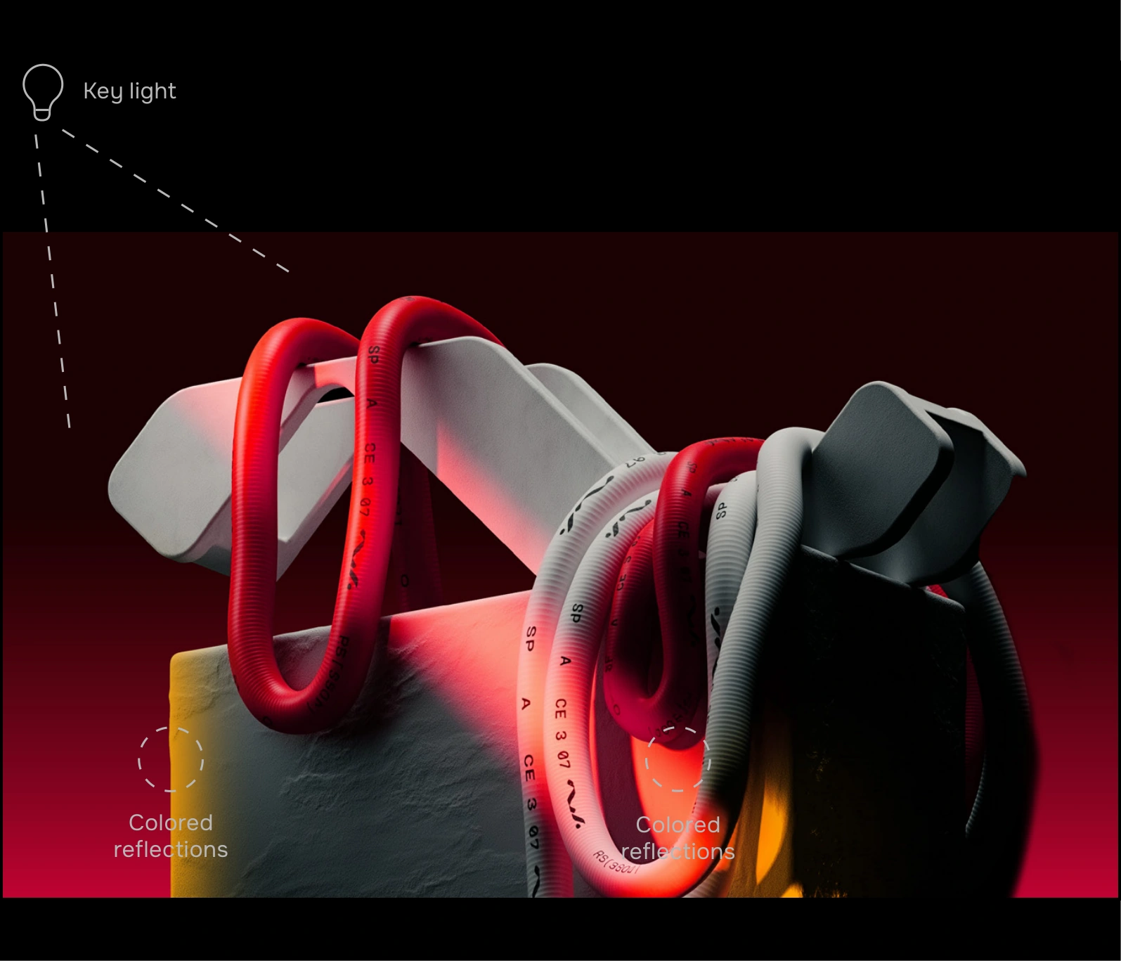
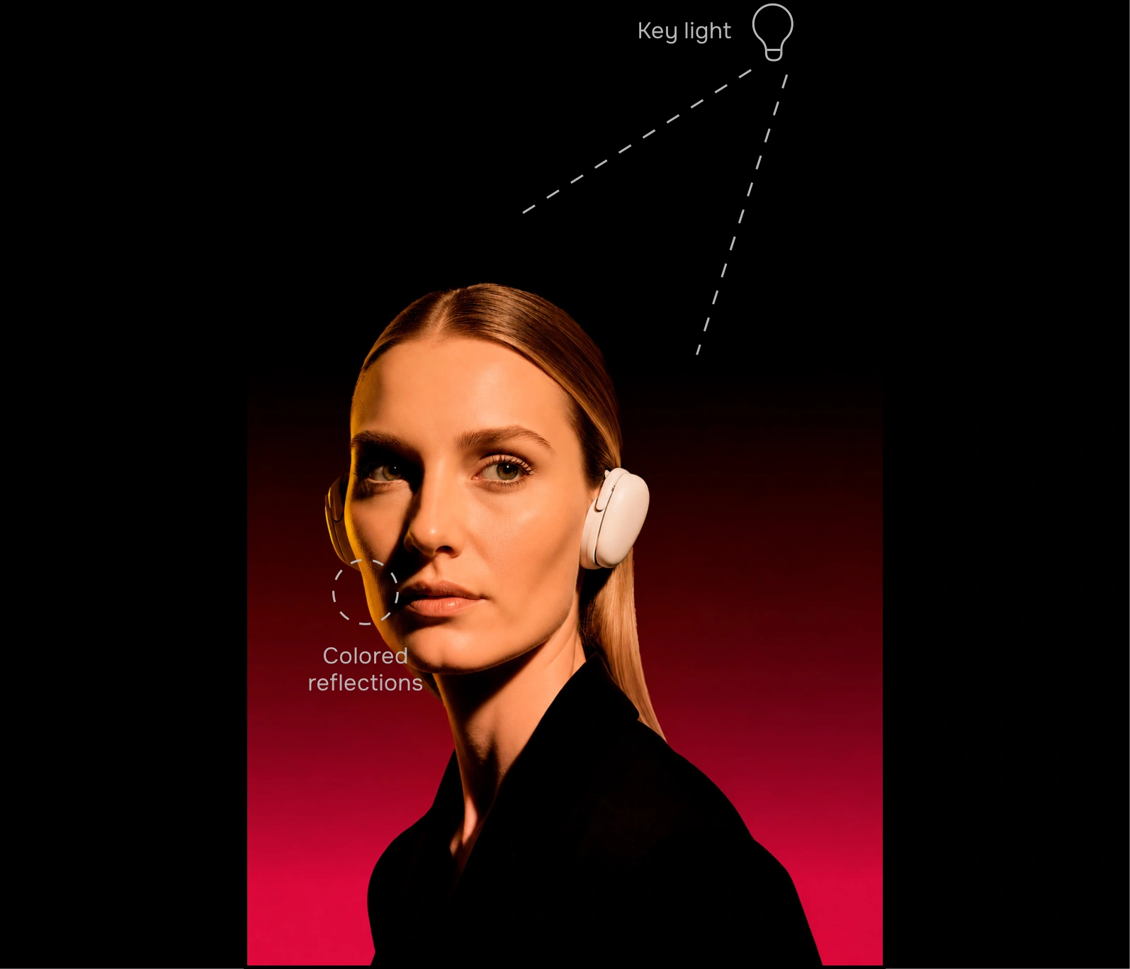
The materials use a minimalist visual treatment. Surfaces are free from complex reflections, random highlights, and pronounced textures.
An architectural concrete or engineered stone texture is used, with a fine, uniform structure and a matte surface
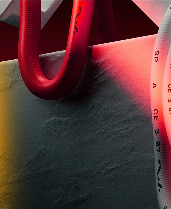
Plastic has a smooth matte surface with low reflectivity. The material defines the object’s form through soft light and shadow transitions, without pronounced gloss or mirror-like highlights
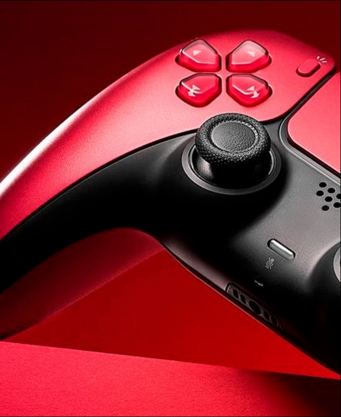
Glass has high transparency and a clean surface. The material is free from complex internal reflections and pronounced color distortion. Its interaction with the environment is created through soft refractions
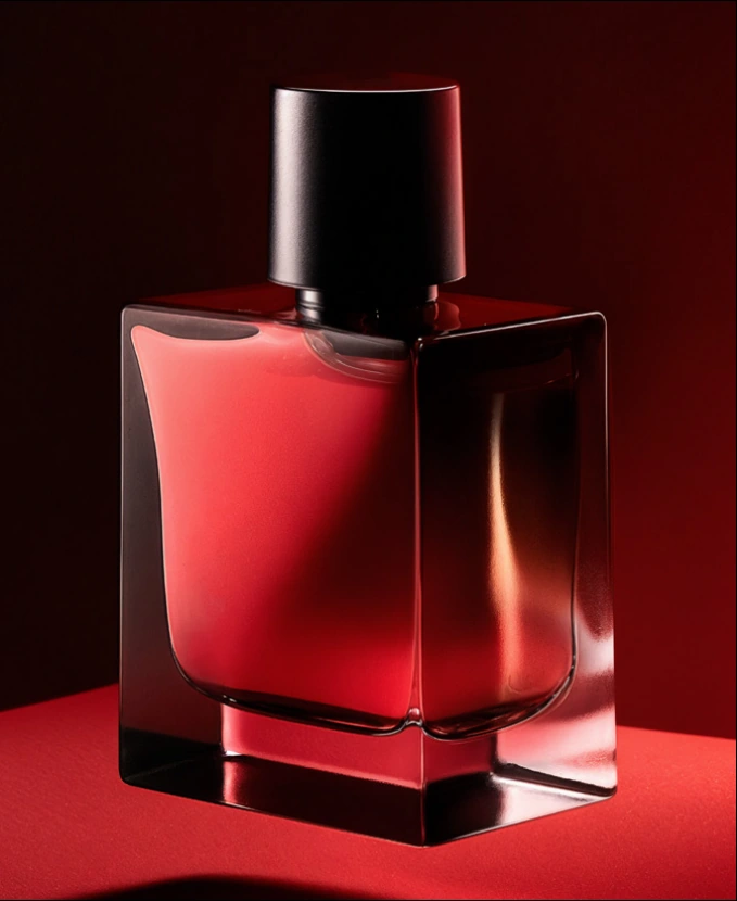
Metal has a smooth coated surface with moderate reflectivity. The surface remains visually clean, with no scuffs, scratches, or other signs of wear

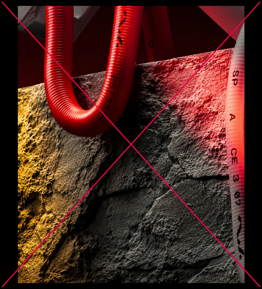
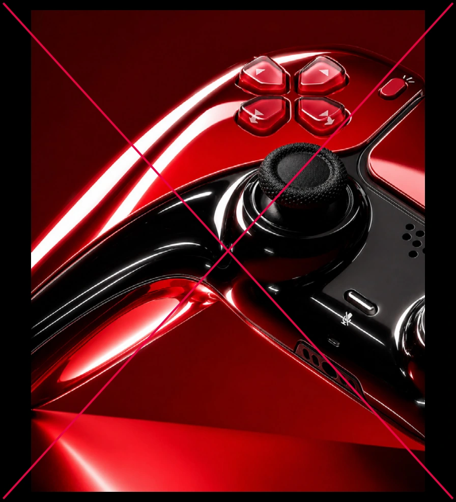
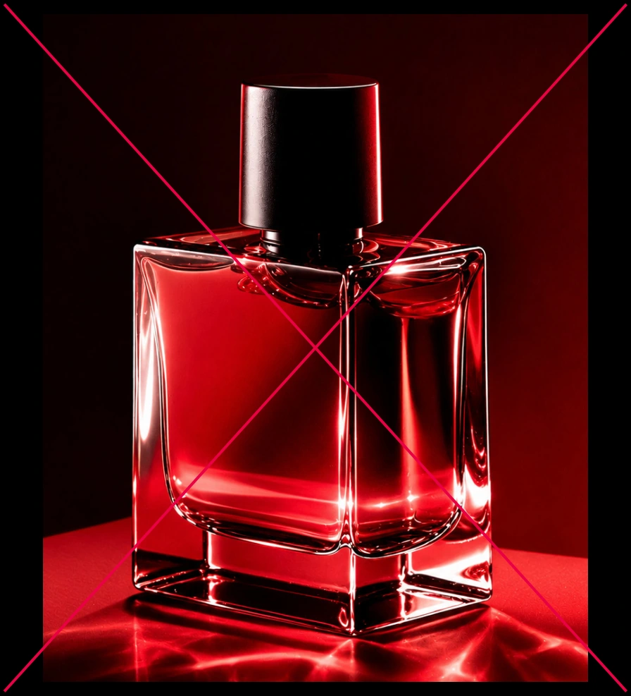

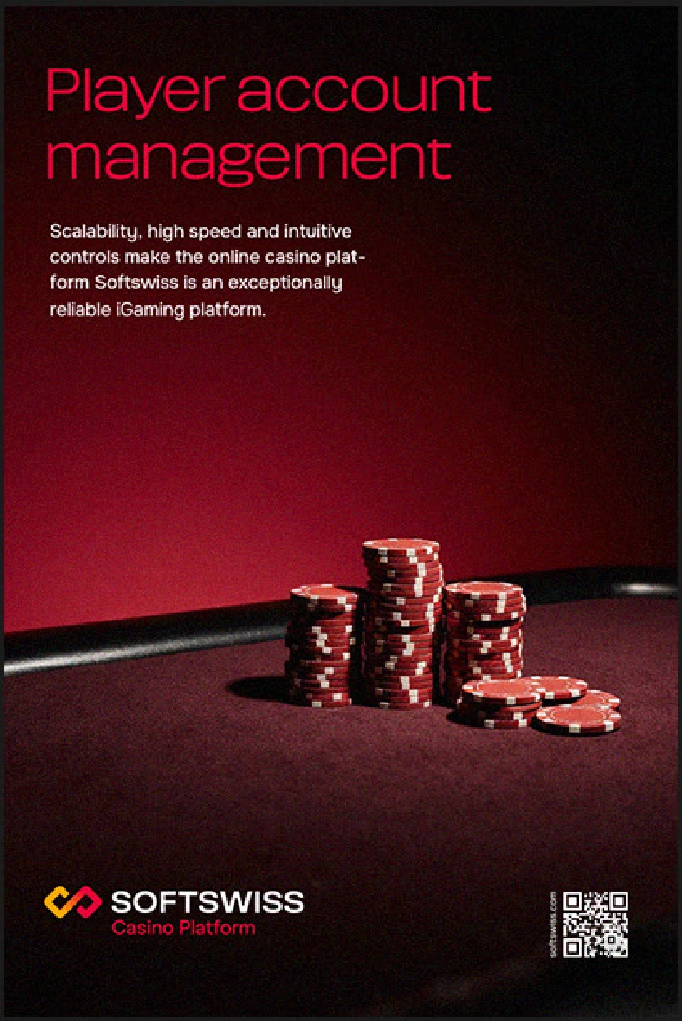
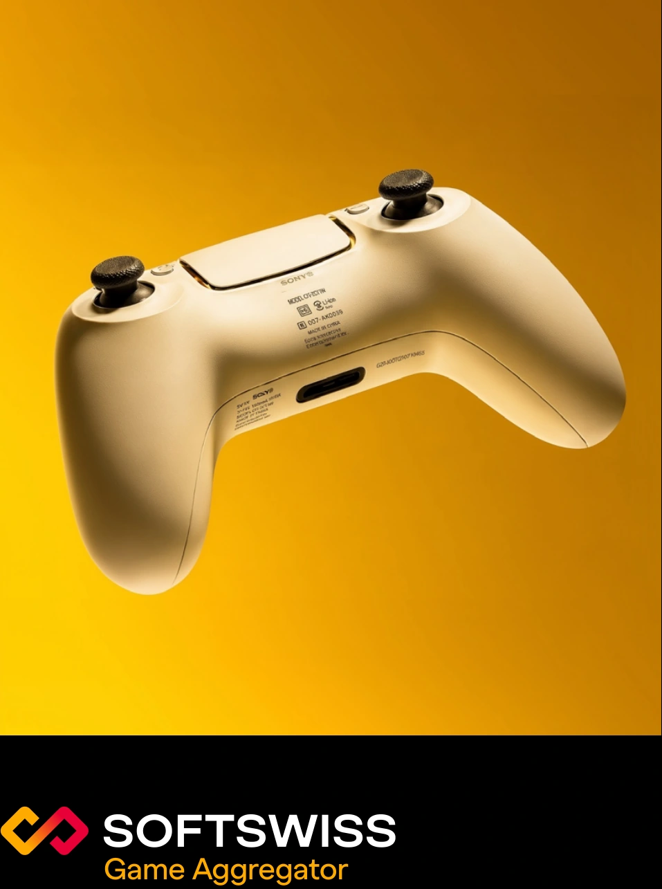
Compositions are generally built around one main object. The background and additional elements remain minimal and do not compete with it. The subject, type of object, and its surroundings may vary depending on the format and communication context. The object may be placed either within a scene or against an isolated background.
Examples of subjects and compositions

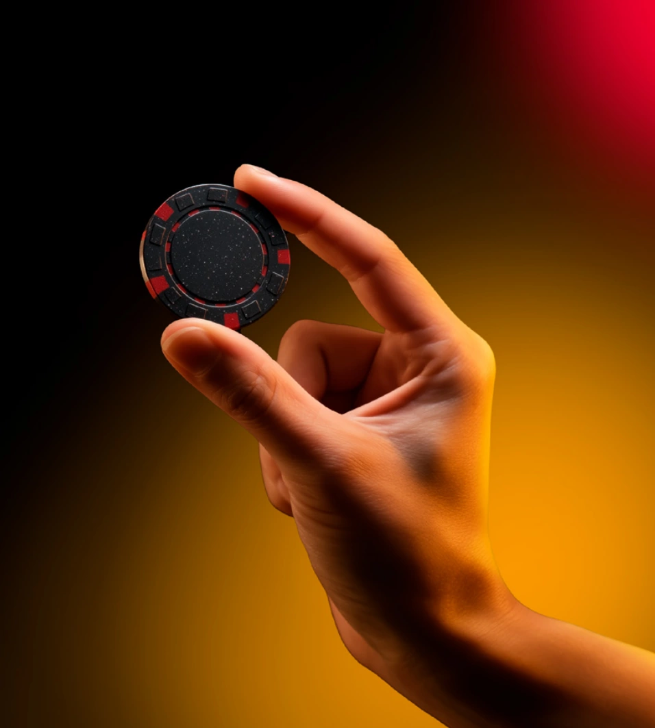

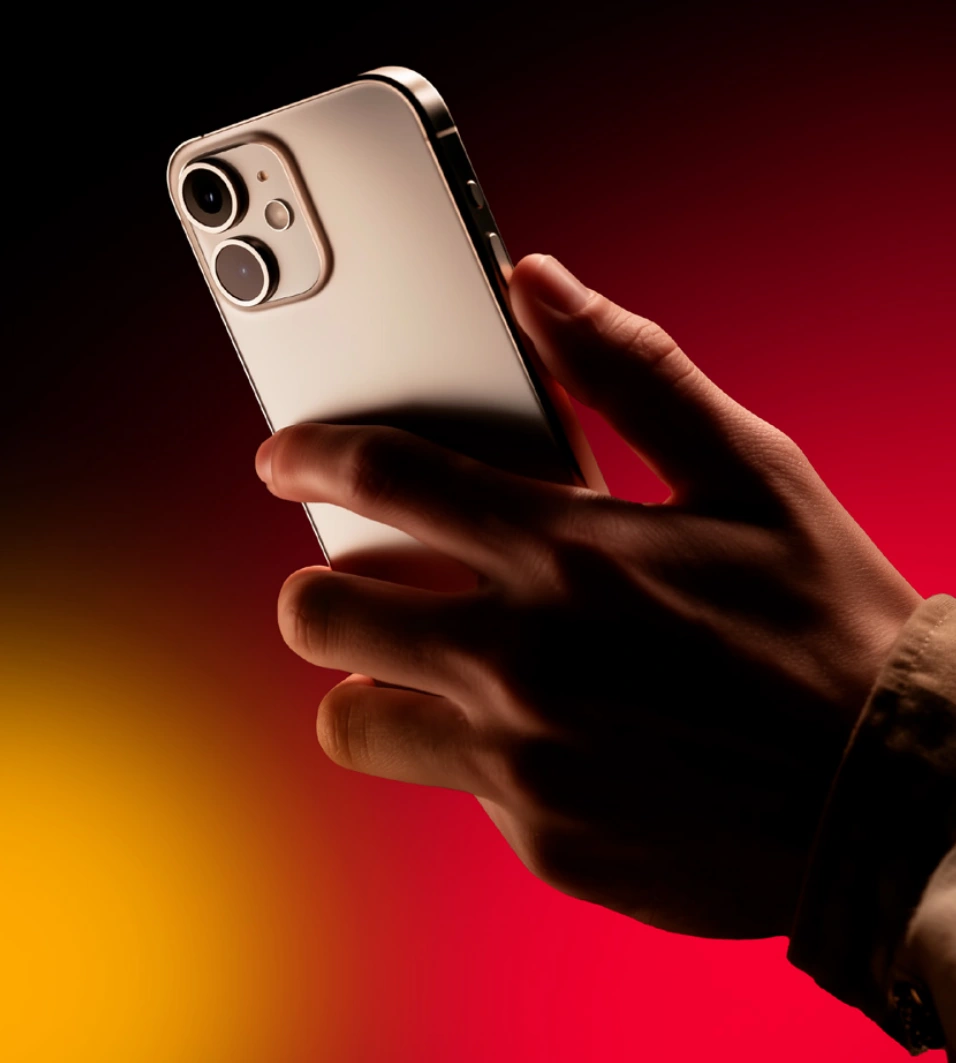
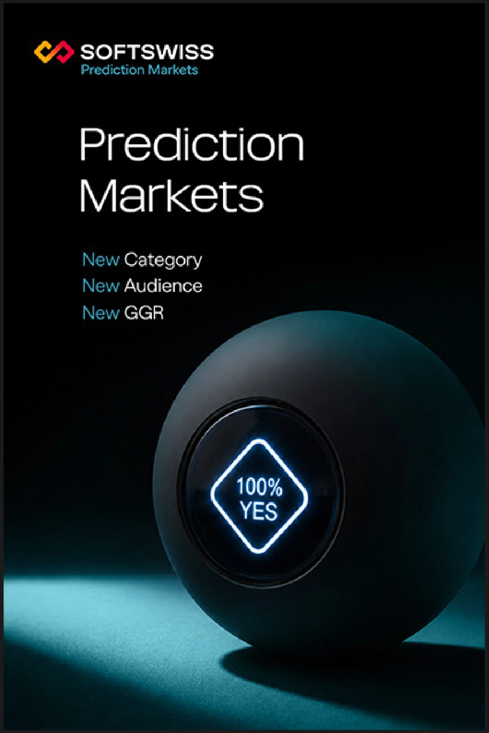
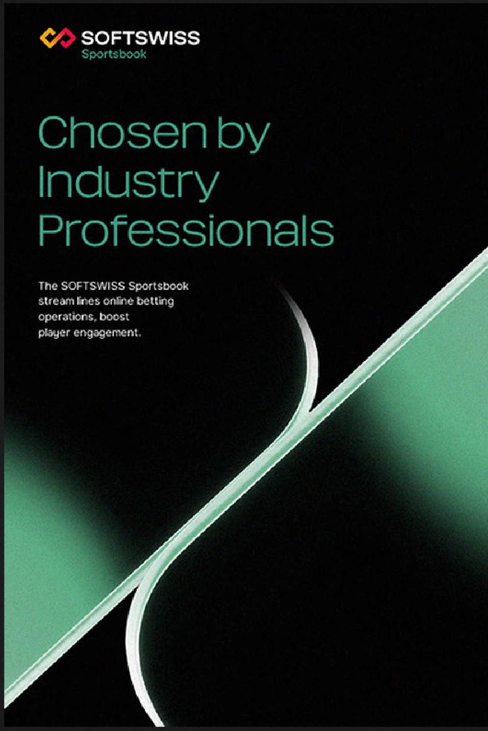
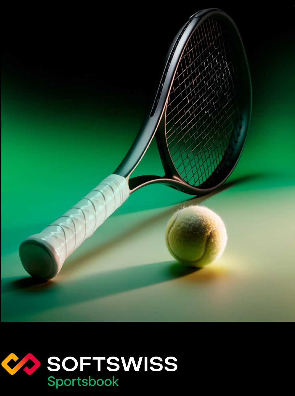
When applying the photography style to sub-brands, color grading is adapted to the corresponding sub-brand color palette. Subjects and objects are selected to reflect each sub-brand’s product focus.
Examples of subjects and compositions


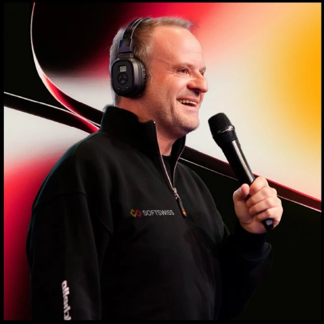
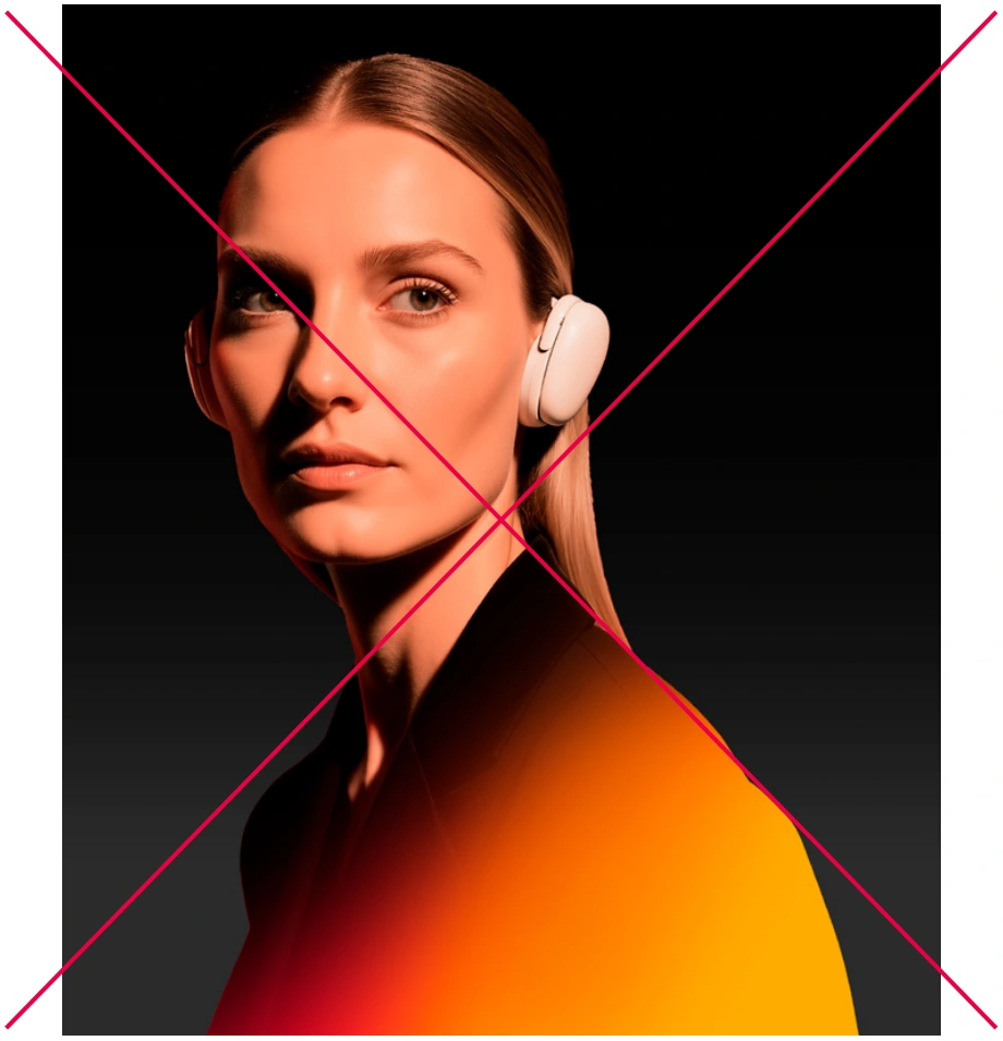
The photography style for people is based on a natural, confident presence and a calm emotional tone. Color grading uses warm tones. Lighting can range from hard and directional to softer light. Clothing should be solid-colored and elegant.



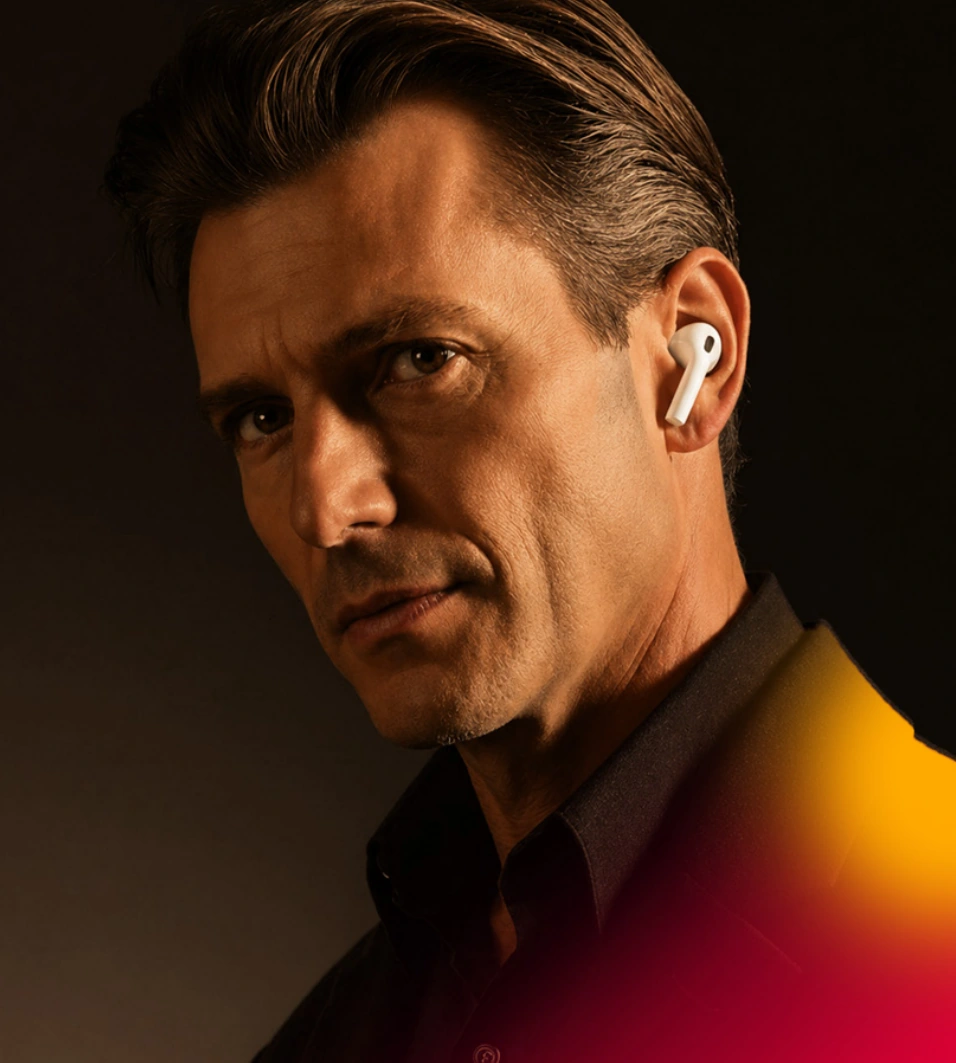
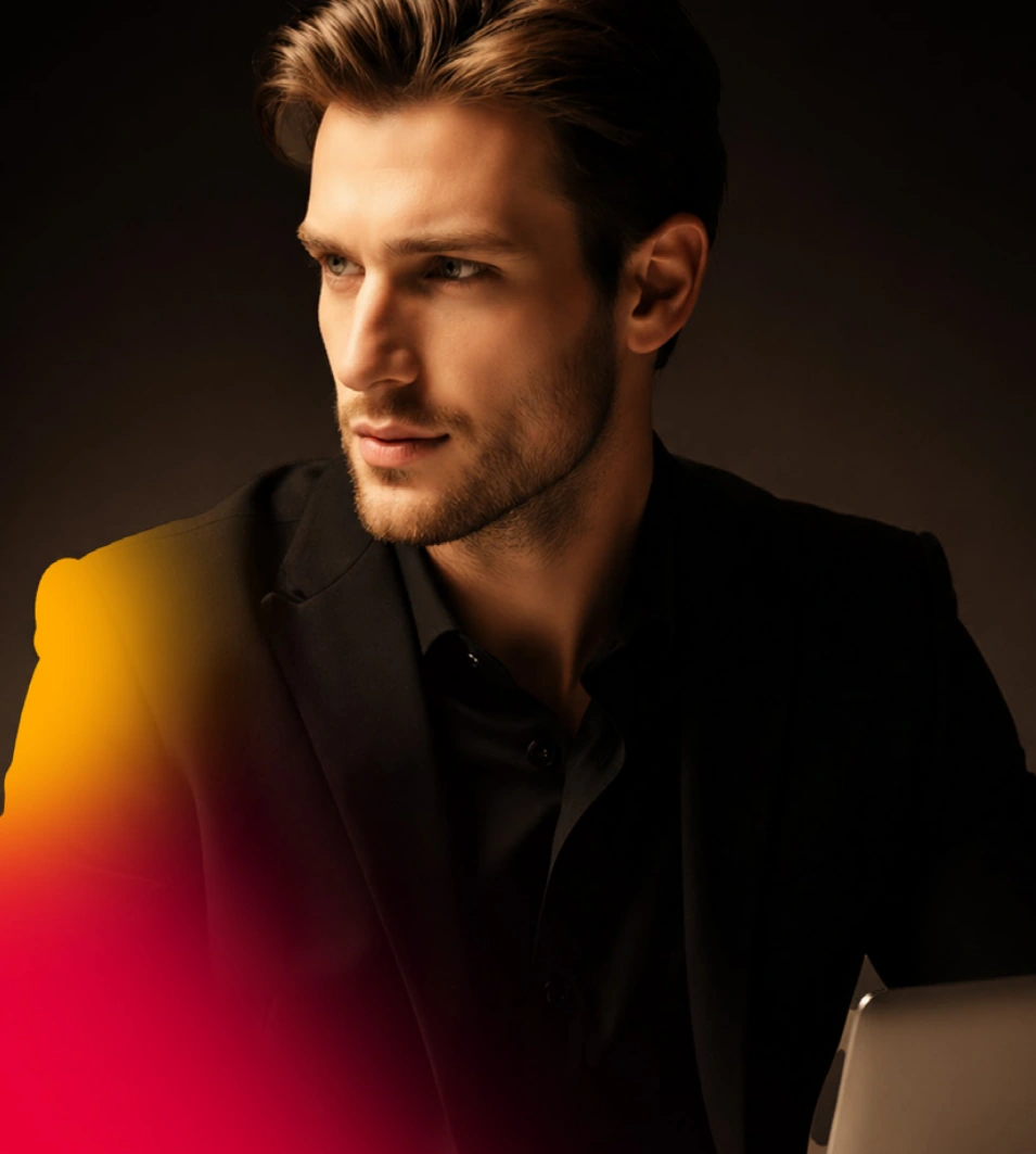
People may smile, communicate, work, interact with a product, or look at the camera. Emotions should always feel natural: a subtle smile, confidence, interest, calmness, engagement, and friendliness.




The background may use either a dark or light color scheme. When needed, a solid background without a gradient may also be used.







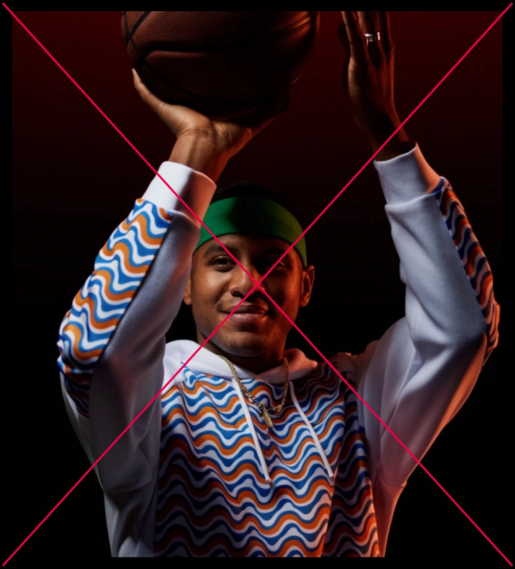
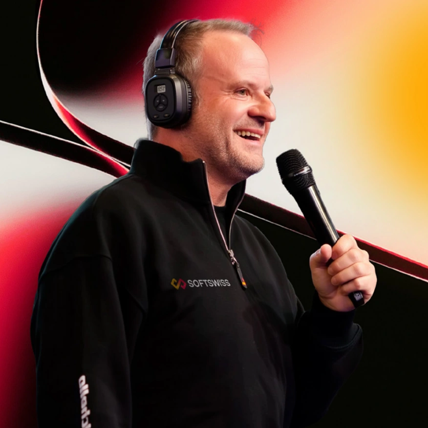
The style of event photography is not regulated by these guidelines. Brand graphic elements may be used to adapt photographs to the visual identity.


[Describe the main subject, scene, or action]. Luxury editorial photography. Deep black background with a subtle [brand color] light spill softly fading into darkness. Dramatic high-contrast lighting featuring a warm directional key light, deep sculptural shadows, and a subtle warm rim light gently outlining the subject. Premium materials with controlled reflections only (no HDRI reflections), clean surfaces, minimalist composition with a single hero subject, cinematic color grading, ultra-realistic image, 8K resolution, no text, no logos.
A premium tennis racket resting alongside a tennis ball on a minimalist tabletop. Luxury sports product photography with a deep black studio background and a subtle emerald green gradient fading smoothly into darkness. Dramatic high-contrast lighting featuring a warm directional key light, deep sculptural shadows, and controlled highlights. The tennis ball is illuminated with rich green reflections, while the racket's frame reveals clean premium materials with subtle controlled reflections only, no HDRI reflections. Minimalist composition with the racket and ball as the single hero subjects. Cinematic color grading, ultra-realistic image, 8K resolution, no text, no logos.

The central elements of the video style are the brand diamonds and smooth gradient transitions. The graphic elements move fluidly, maintaining the sense of a unified composition. The diamonds move closer together, move apart, and shift within the frame while remaining visually connected.
The animation is based on smooth rotation. Movement follows predominantly diagonal trajectories, without abrupt changes in direction. The beginning and end of each movement are softened with smooth easing.
Elements may extend partially beyond the frame and vary in cropping as they move.
The logo symbol is revealed with a mask, while the wordmark fades in using opacity.


Gradient transitions within the logo symbol appear as layout elements enter and exit.
The main animation principle for the brand elements is the slow rotation of the entire composition formed by two touching diamonds. At the same time, each diamond rotates smoothly around its own axis. Gradients flow softly within the shapes. The edges of the diamonds are thin and precise, with subtle gradient transitions. The diamonds either enter the frame or fade in.
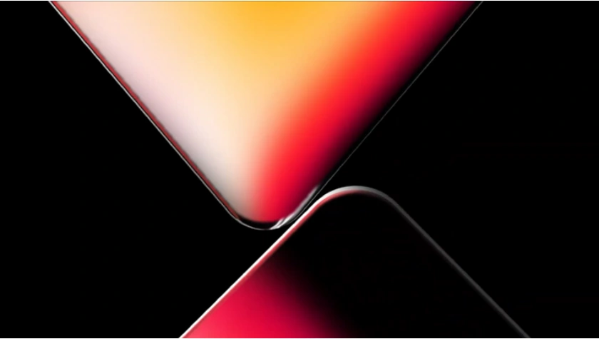
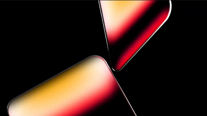
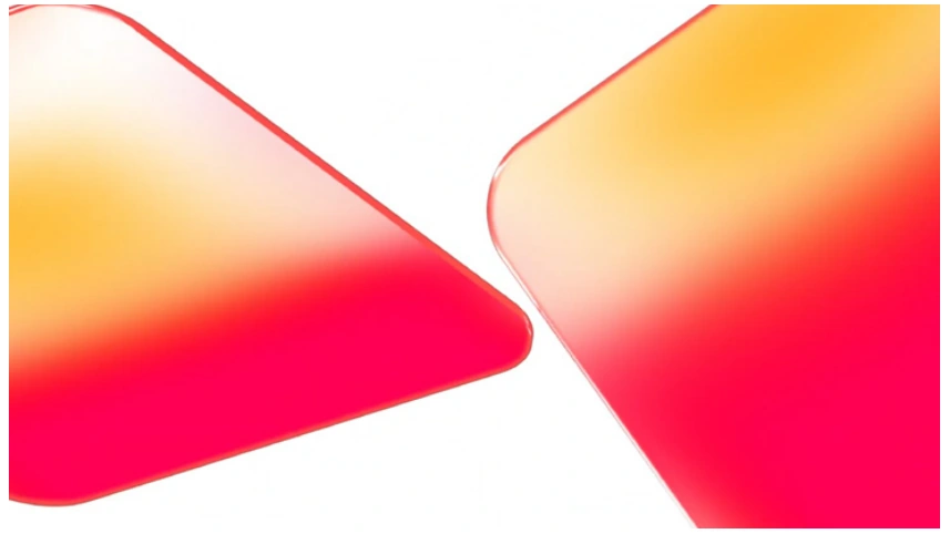
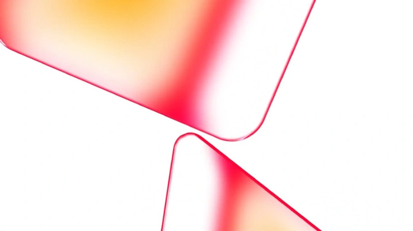
The animation follows the same principles as on the previous slide. Colors correspond to the respective sub-brand color schemes.
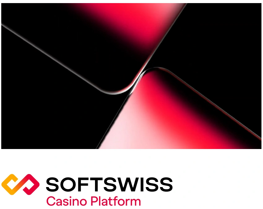
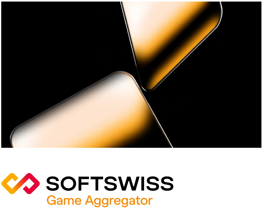

Gradients move smoothly within the layout. The red and yellow gradient areas blend into black or white, depending on the color scheme.


00:00

Background with no elements
00:01
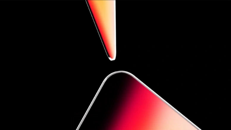
Dynamic entrance and rotation of the diamonds. The diamonds move toward the center
00:01-00:02

The diamonds move apart, revealing the logo
00:02-00:05

The diamonds rotate. Gradients flow through the diamonds, logo symbol, and text
00:05-00:06
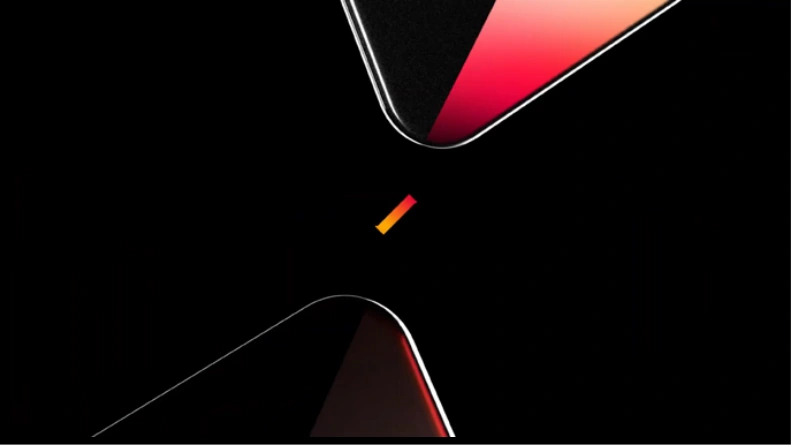
The diamonds rotate. The logo fades out
00:06-00:07
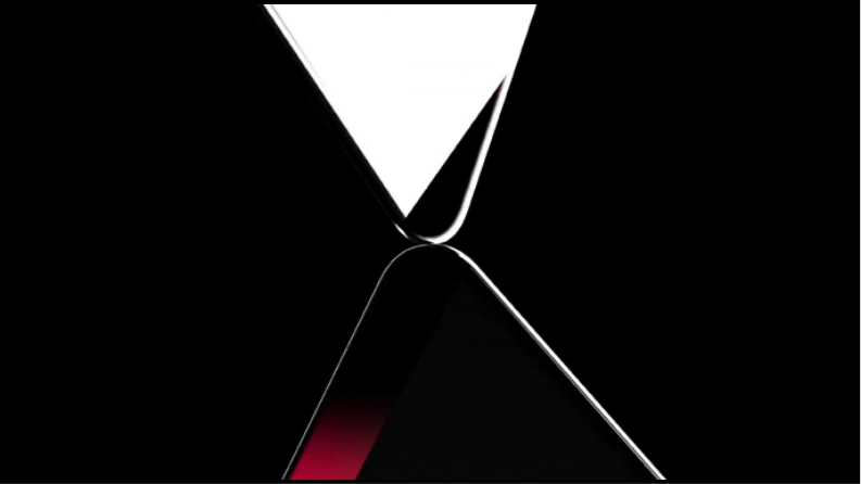
The diamonds come into contact
00:07

Dynamic exit of the diamonds
00:00

Background with no elements
00:01
The logo, headline, and diamonds appear simultaneously
00:01-00:02
Text blocks appear. Gradients flow within the logo symbol and diamonds
00:02-00:06
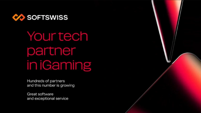
Gradients flow within the logo symbol and diamonds. The diamonds rotate
00:06-00:08
The logo, diamonds, and headline disappear simultaneously. The text blocks fade out
00:08

Background with no elements
00:00

Background with no elements
00:01
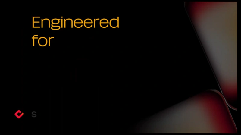
The logo, headline, and diamonds appear simultaneously
00:01-00:02
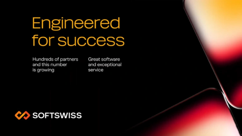
Text blocks appear. Gradients flow within the logo symbol and diamonds
00:02-00:06
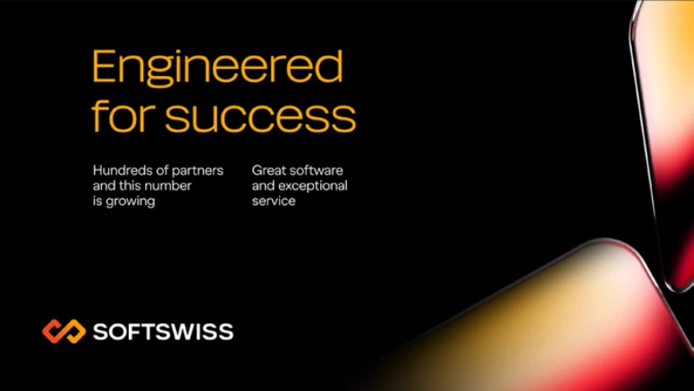
Gradients flow within the logo symbol and diamonds. The diamonds rotate
00:06-00:08
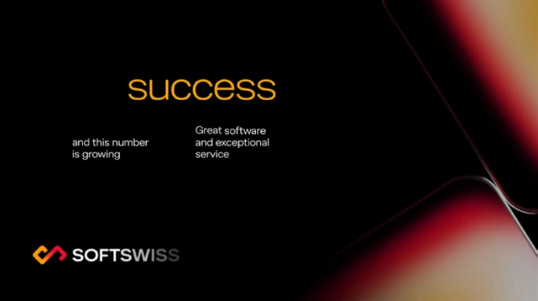
The logo, diamonds, and headline disappear simultaneously. The text blocks fade out
00:08

Background with no elements
00:00

Background with no elements
00:01
he logo symbol, headline, gradient, and caption appear simultaneously
00:01-00:02
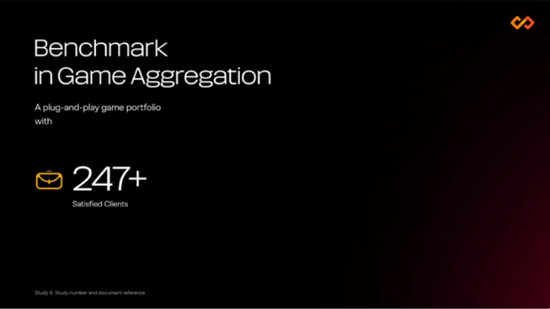
Text blocks appear. The icon scales in, while the numbers animate using a counter. Gradients flow within the logo symbol
00:02-00:04
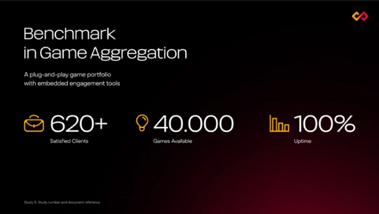
All numbers and icons appear. The gradient moves across the layout
00:04-00:06
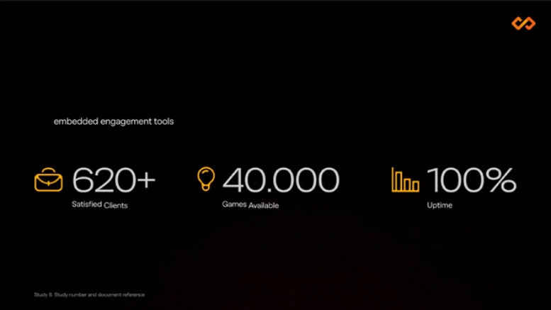
The headline and text blocks disappear. Gradients continue to flow within the logo symbol
00:06-00:08
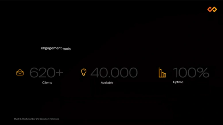
The remaining elements disappear
00:08

Background with no elements
00:00

Background with no elements
00:01
The logo symbol, headline, gradient, and caption appear simultaneously. Gradients flow within the logo symbol
00:01-00:02
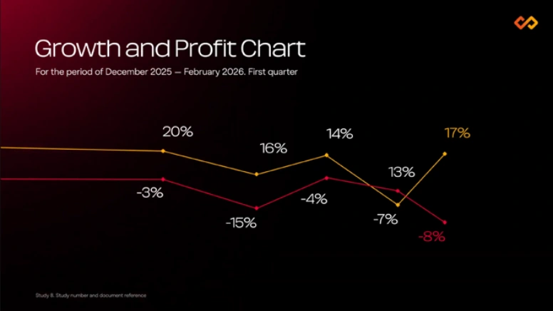
The chart appears from the left, while the numbers animate using a counter. The gradient moves
00:02-00:04
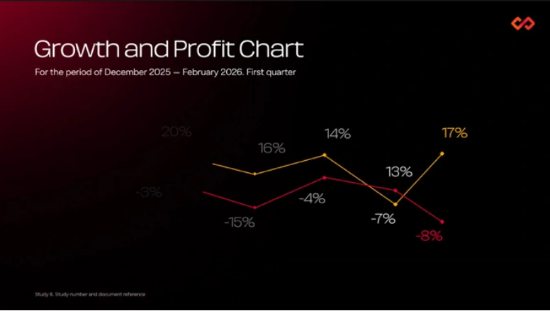
The chart exits to the left. Gradients flow within the logo symbol
00:04-00:06

The remaining elements disappear
00:00

Background with no elements
00:01
The logo symbol, headline, gradient, and caption appear simultaneously. Gradients flow within the logo symbol
00:01-00:02
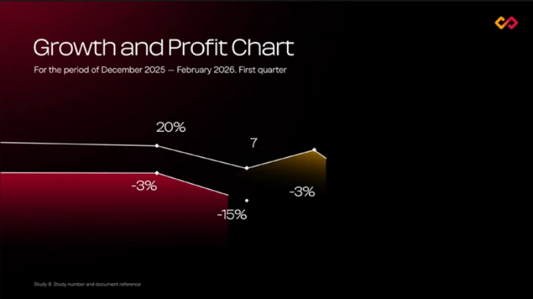
The chart appears from the left, while the numbers animate using a counter. The gradient moves
00:02-00:04
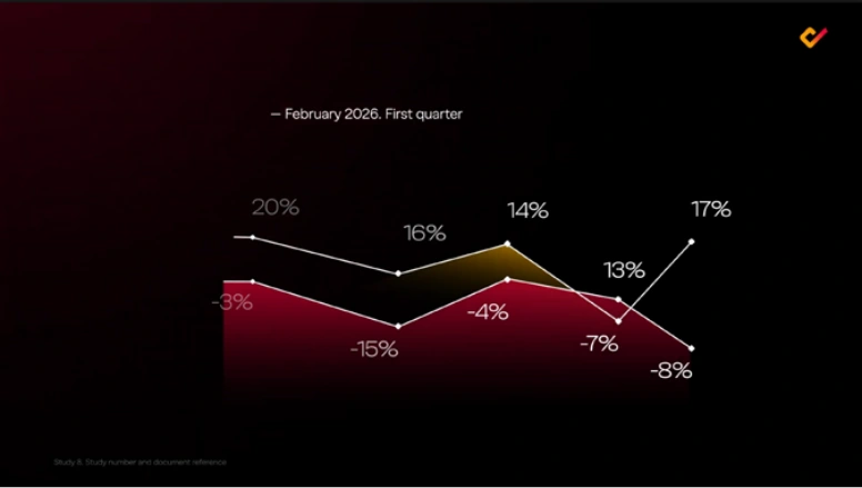
The chart exits to the left. Gradients flow within the logo symbol
00:04-00:06

The remaining elements disappear
00:00

Background with no elements
00:01
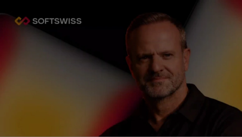
The logo, speaker, and diamonds fade in using opacity
00:01-00:02
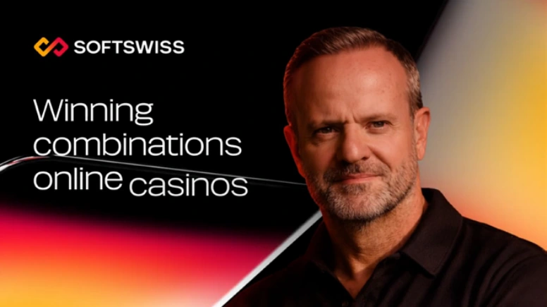
The headline appears. The diamonds rotate. Gradients flow within the logo symbol and diamonds
00:02-00:04

The text block appears. Gradients flow within the diamonds. The speaker slowly scales up
00:04-00:06
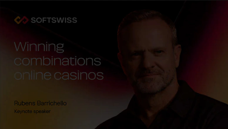
All elements fade out using opacity
00:08

Background with no elements
00:00

Background with no elements
00:01
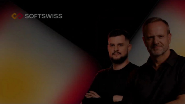
The logo, speakers, and diamonds fade in using opacity
00:01-00:02
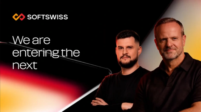
The headline appears. The diamonds rotate. Gradients flow within the logo symbol and diamonds
00:02-00:04
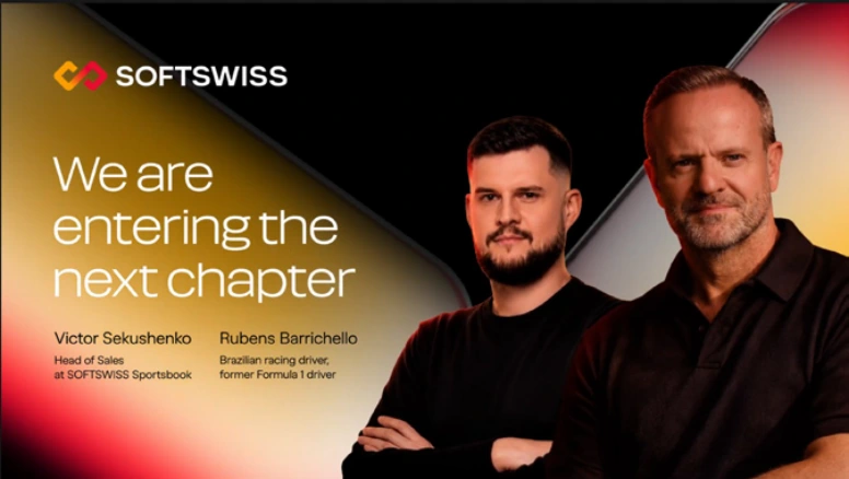
The text block appears. Gradients flow within the diamonds. The speakers slowly scale up
00:04-00:06
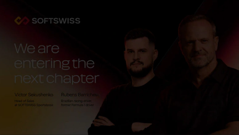
All elements fade out using opacity
00:08

Background with no elements
The lower-third panel is angled and appears with a rotating motion.
00:00

The lower-third panel appears with a rotating motion
00:01-00:02
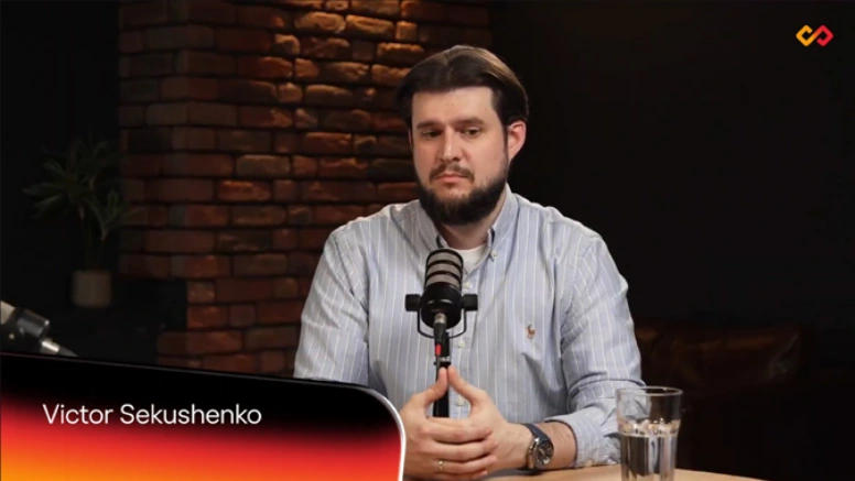
The gradient shifts across the panel into a darker state. The headline appears
00:02-00:04
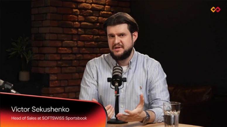
The text block appears. Gradients flow along the edges of the panel
00:04-00:05
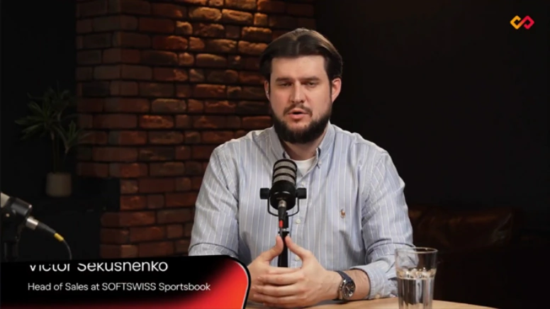
The panel folds away, masking the text as it disappears
00:05-00:07

00:00
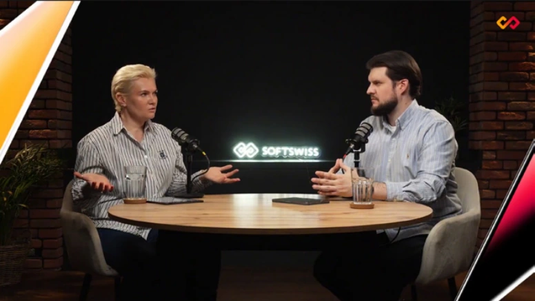
The diamonds enter diagonally
00:01
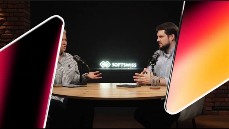
The diamonds cover the video. They rotate as gradients flow within them
00:01-00:02
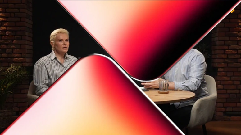
The diamonds come together
00:02-00:03
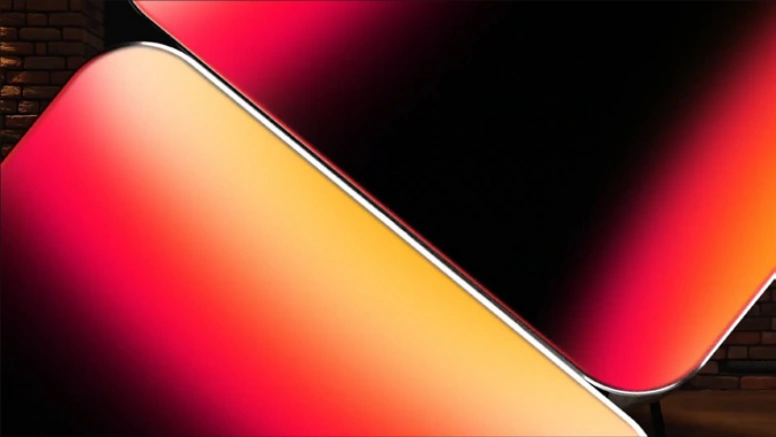
The diamonds rotate and shift quickly along a diagonal, covering the video
00:03-00:04

The new video is revealed with a wipe
00:05

Icons appear through scaling and rotation. Micro-animations may be applied to individual details within the icons.
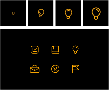
The icons rotate around their own axis, with the gradients moving along with them.